THE Vancouver Canucks

Sedin Retirement Week

sedin week

Designing the logo to retire Canuck legends Henrik and Daniel Sedin

mission

The Vancouver Canucks were officially retiring the numbers of the Sedin twins with a week long celebration of their 17–season career. I was tasked with creating a logo that combined both their numbers, 22 and 33.

outcome

The final logo connects the two numbers by slightly interlocking in an offset, allowing them to remain distinctly 22 and 33. This logo was used throughout the week for marketing, social media, retail, and more during the 3 games set aside to honour Henrik and Daniel.

All work shown was created (start–finish) by myself, with feedback from the Design Manager, Leah Browne and the talented team at the time.

EMPLOYER

Canucks Sports & Entertainment (CSE)

Position

Graphic Designer

assigned to

Logo Design
Retirement Week Tickets
Jersey Retirement Plaza Signing Wall
Canuck Legends Poster
Game-Day Social Media

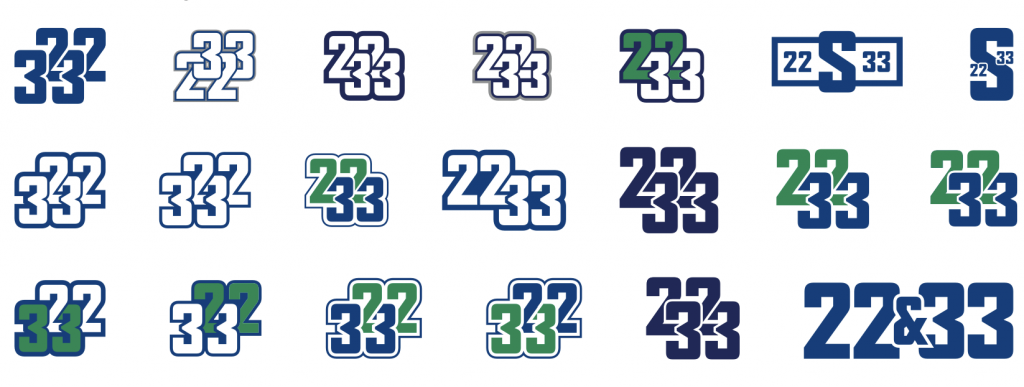
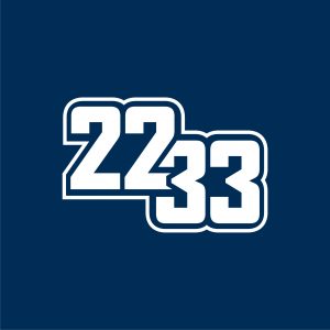
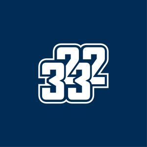
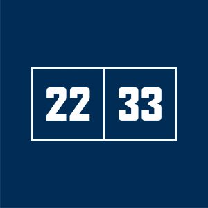
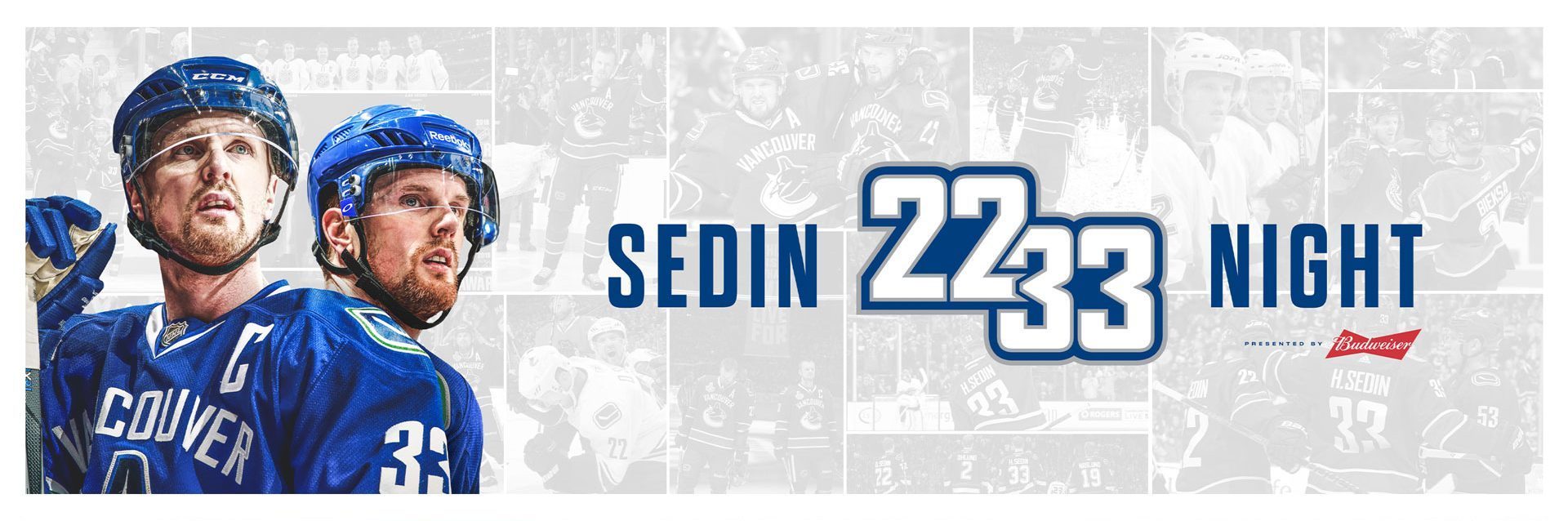
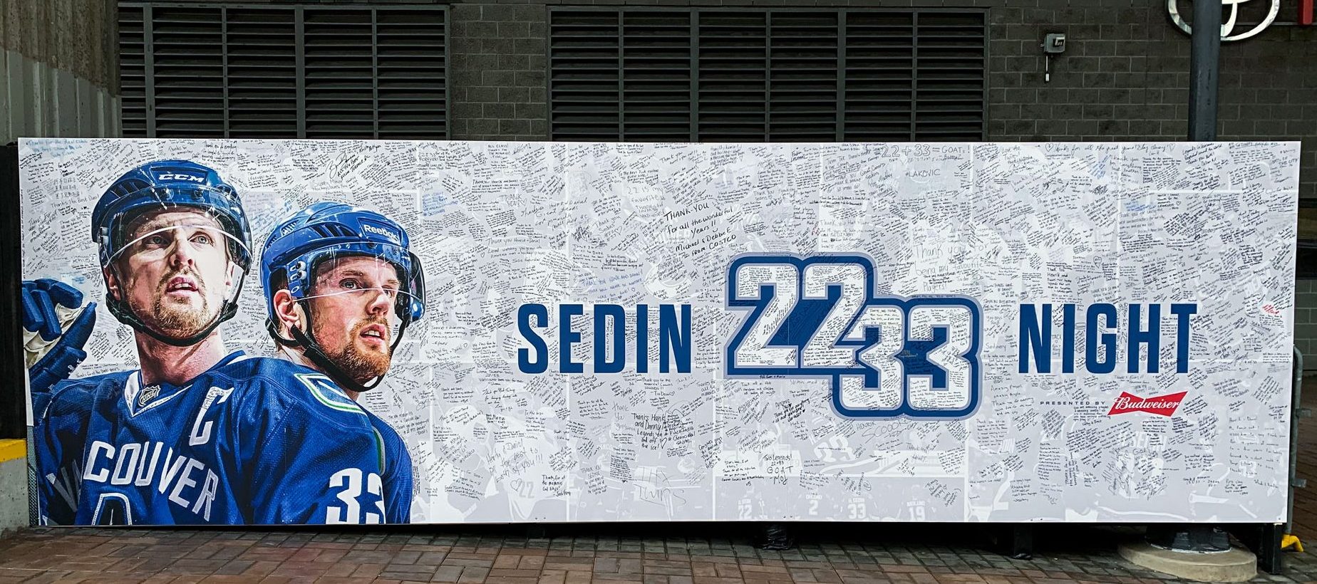
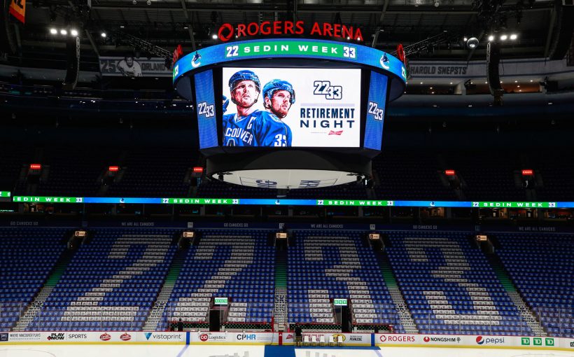
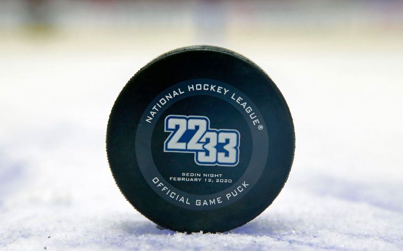
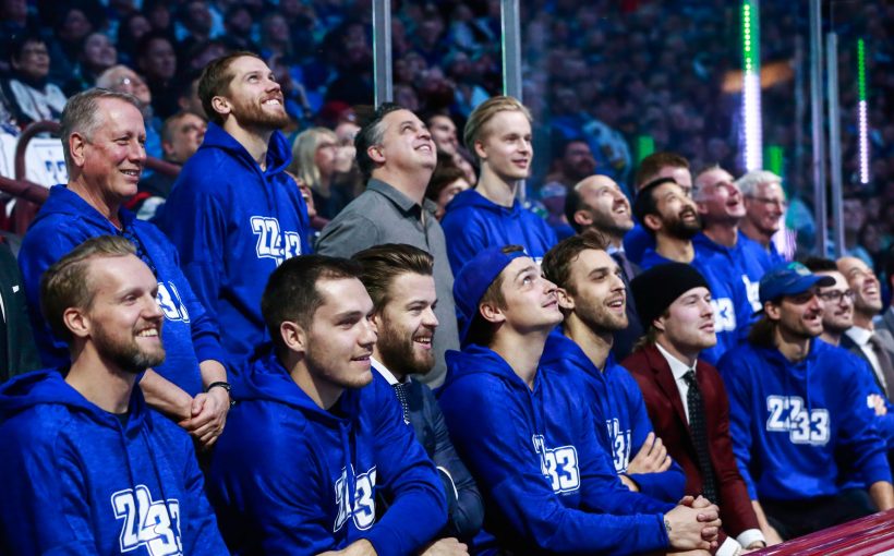
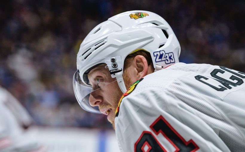
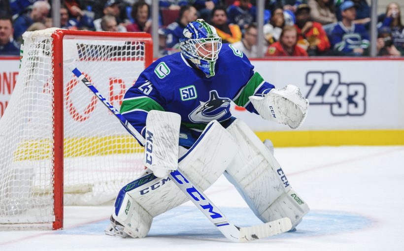
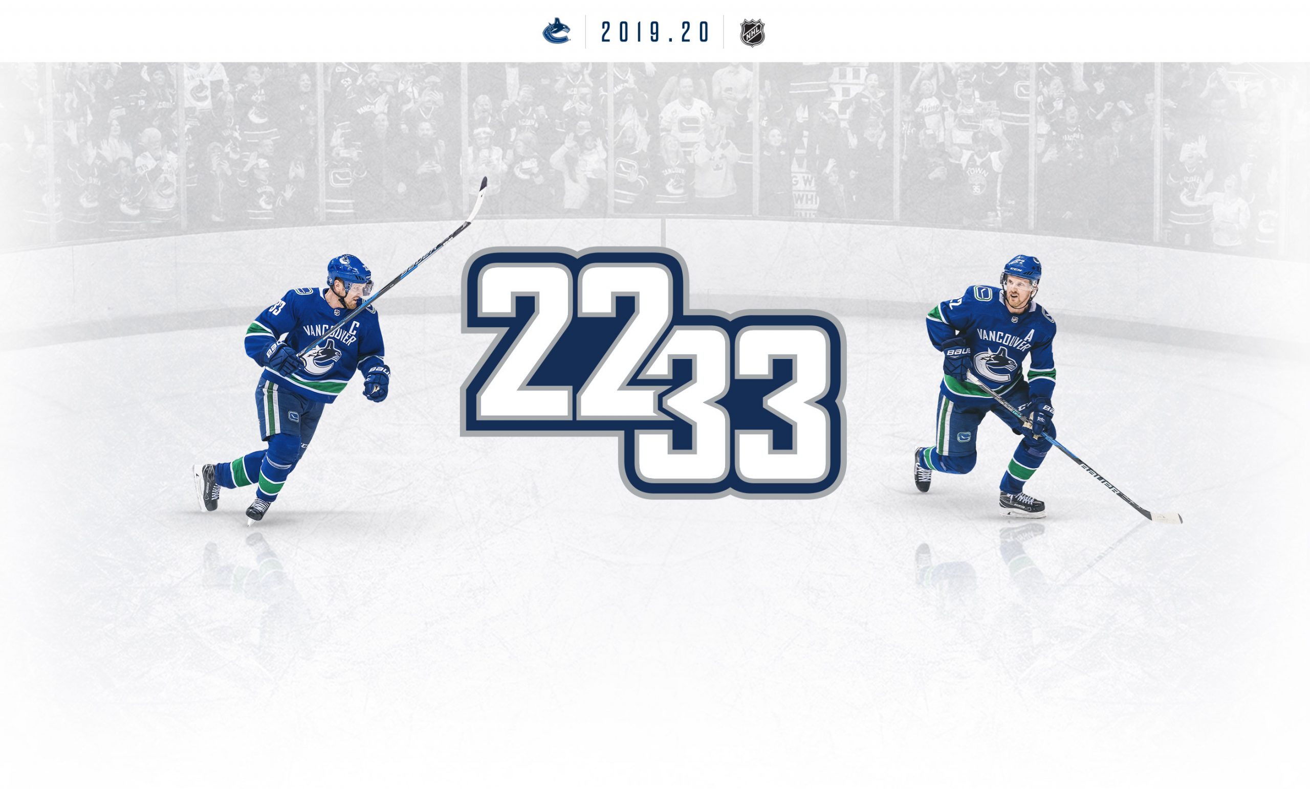
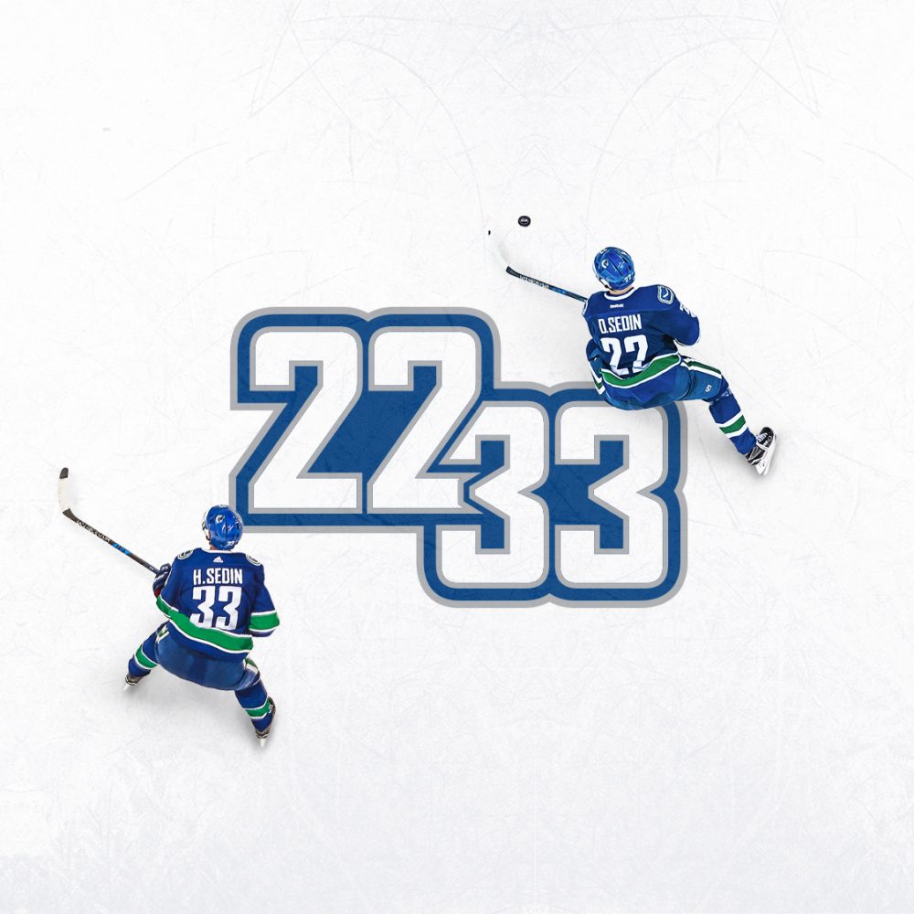
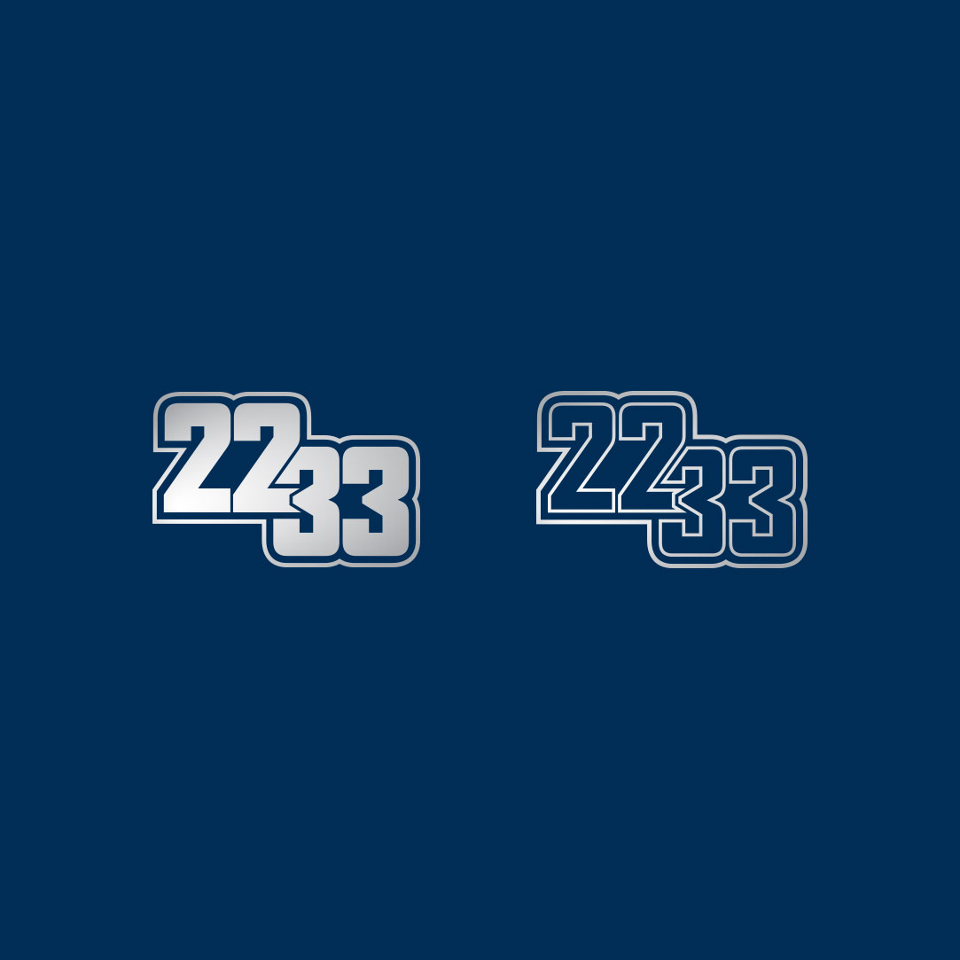
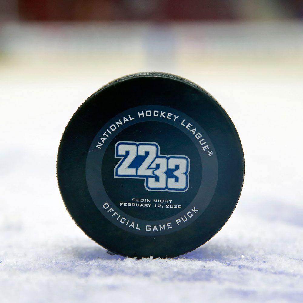
The logo, or should I say the challenge. Create a logo that combines two numbers, pretty straightforward right? Let me be the first to tell you–easier said than done. In addition, their numbers should not be modified – essentially be as close to the jersey as possible. 

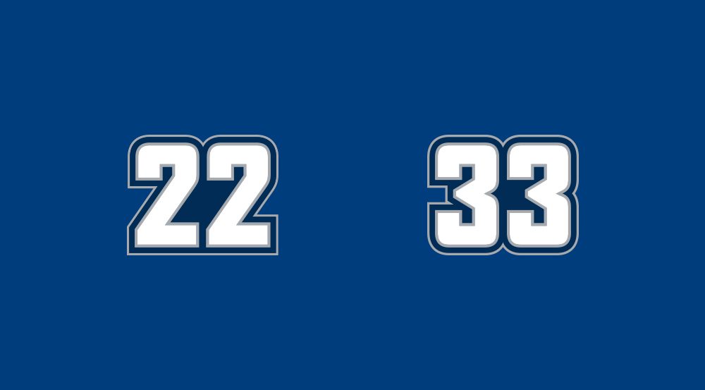
To start I began by sketching possibilities of how the numbers 22 and 33 could be connected. I quickly realized this was somewhat futile. I needed to use the exact numbers (in the correct typeface) to know if it would work realistically. I shifted gears and switched to Illustrator to play around with possible connections.

Logo development exploration

© Canucks Sports & Entertainment

One horrendously messy Illustrator file later. I had iterated somewhere between 50–100 attempts to link these two numbers. It turns out trying to connect two numbers, while keeping them distinct enough while equally balanced, is pretty hard. It was at least for me, with just over 2 years on the job post degree and little professional logo experience.

From there I selected the better iterations, and printed out 3 pages worth to see what was working and which I could eliminate as options. It became immediately clear that the numbers needed to have colour applied in the same way, otherwise one would overpower the other. Connecting them too closely became difficult to interpret, and a bit hard on the eyes.

Logo concepts

© Canucks Sports & Entertainment

After many iterations I was able to land on these final three options. Each using a different degree of connection, and achieving the objectives of distinction and equal representation. The choice was unanimous. I’m not sure which version went all the way up the ladder, but I do know that final sign-off was required by ownership and Sedin twins themselves!

Final logos

© Canucks Sports & Entertainment

The finalized logo! It was an honour to be assigned with this challenge, and I’m proud of the final design solution. It was a whirlwind project with not a ton of time to complete, but absolutely worth the overtime hours.

Back in June of the previous year, I was assigned as the project lead for the season tickets layout and design. This is the first project that features the upcoming seasons design campaign, which was unusually colourful for the 50th anniversary year.

It was as this point it became clear these retirement week games would need to be distinctly separate, and should have its own visual design style. To achieve this, the 3 games utilized a white theme to highlight them amongst the other 38 tickets.

fun fact  In the middle ticket shown–Daniel has been frankensteined in photoshop to fit nicely behind Henrik. That shoulder is not his own!

Sedin Week Tickets

© Canucks Sports & Entertainment

Canuck Legends Poster Design

© Canucks Sports & Entertainment

The first game of the week was to recognize the other legends the Sedin twins were joining, as only four previous players have ever earned the honour of a number retirement.

One assignment for this game included a poster to feature the new lineup of Canuck legends. Which would be used for giveaways and to sell in the retail store.

I first began by finding the best shots per player in the correct jersey. Then started assembling the collage, testing which images worked best together. I created this from left to right–oldest to newest, as Stan Smyl had the fewest images to work with. From there it was a matter of considering how I could position the players, using diverse scales and layering to create a dynamic composition.

This was created using Adobe Photoshop (for the main collage) and Adobe inDesign (for the small bio’s at the bottom).

Arena Plaza Wall for the Jersey Retirement Game

© Canucks Sports & Entertainment

Another fun project I had the opportunity with, was to create a design for a large wall to be installed in the centre Plaza area outside of the arena, where pre-game activities occur. I scoured through the enormous gallery from their 17 seasons, to find the best of the best pictures to feature the pair. 

This was created using Adobe Photoshop.

Wall Signer

For the week, social media assets were needed for each game-day, and I already handled these as part of my day-to-day responsibilities. This included assets to cover Instagram, Facebook, and Twitter.