Helping a local Vietnamese restaurant rebrand to grow alongside their expansion
TASK
Create a new logo and supporting visual system to rebrand a local restaurant, that would better represent Bánh Mì Très Bon today–modern Vietnamese cuisine.
OUTCOME
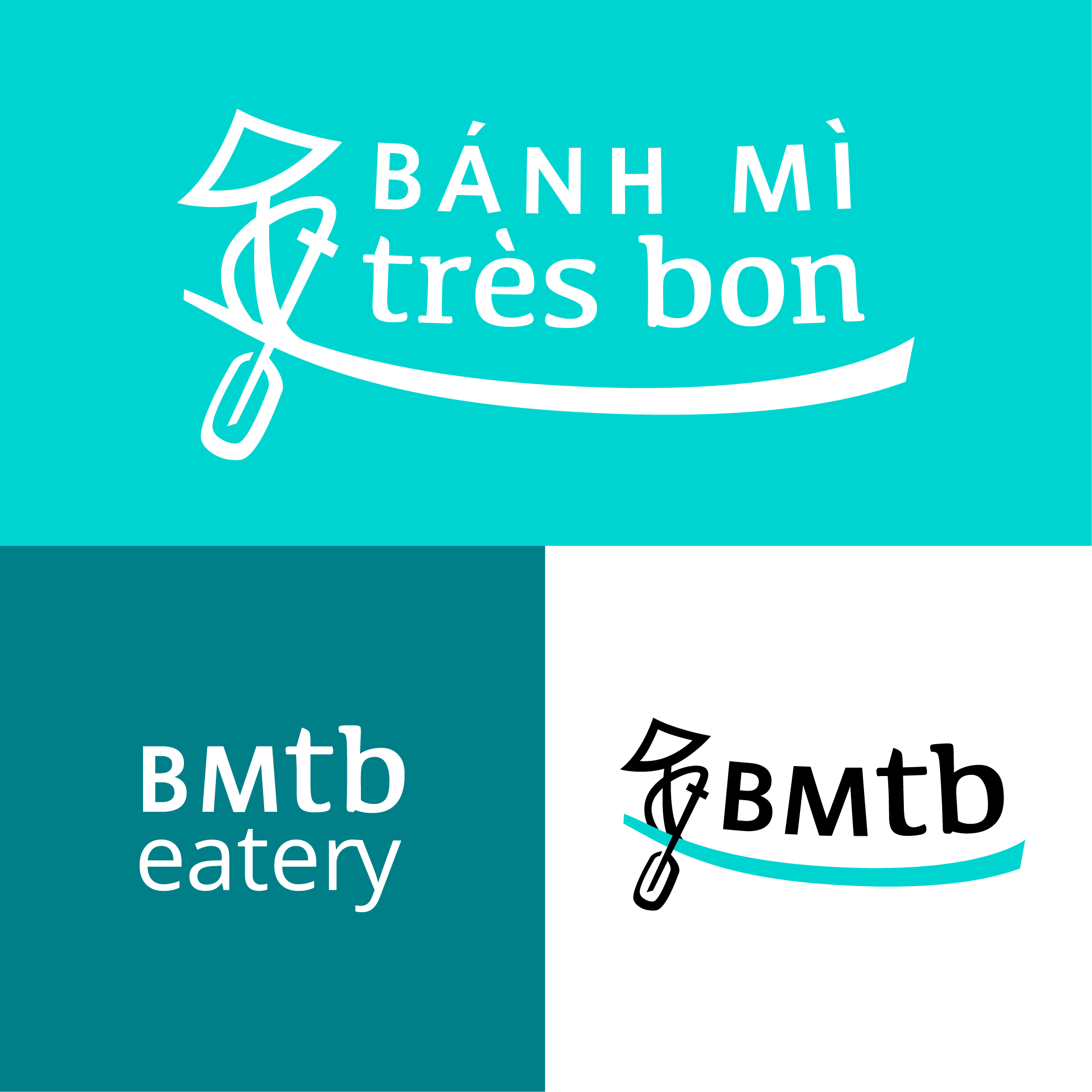
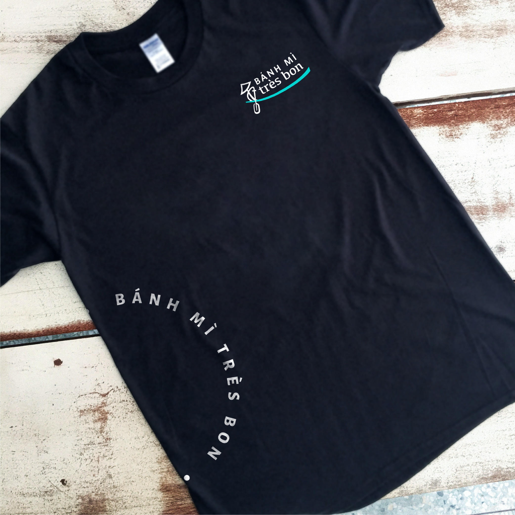
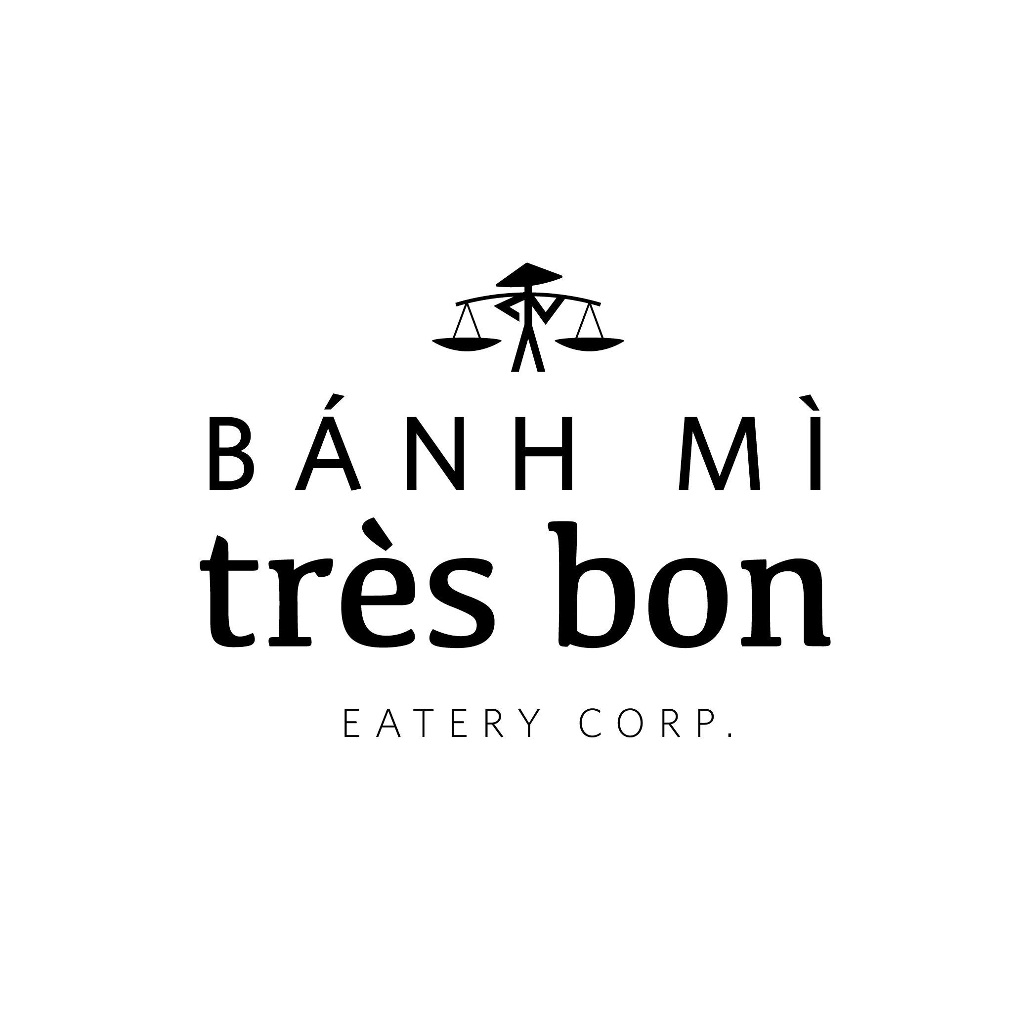
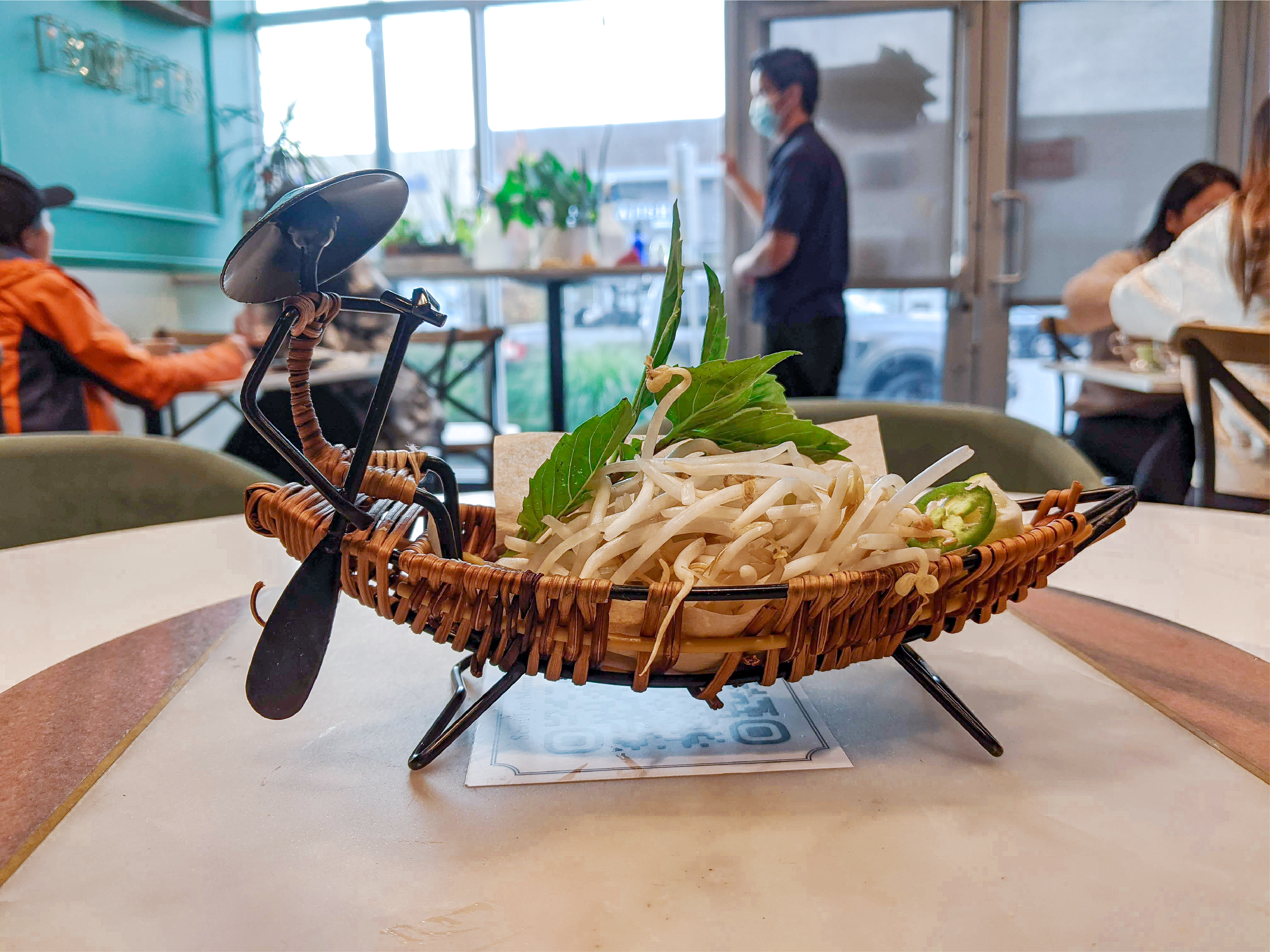
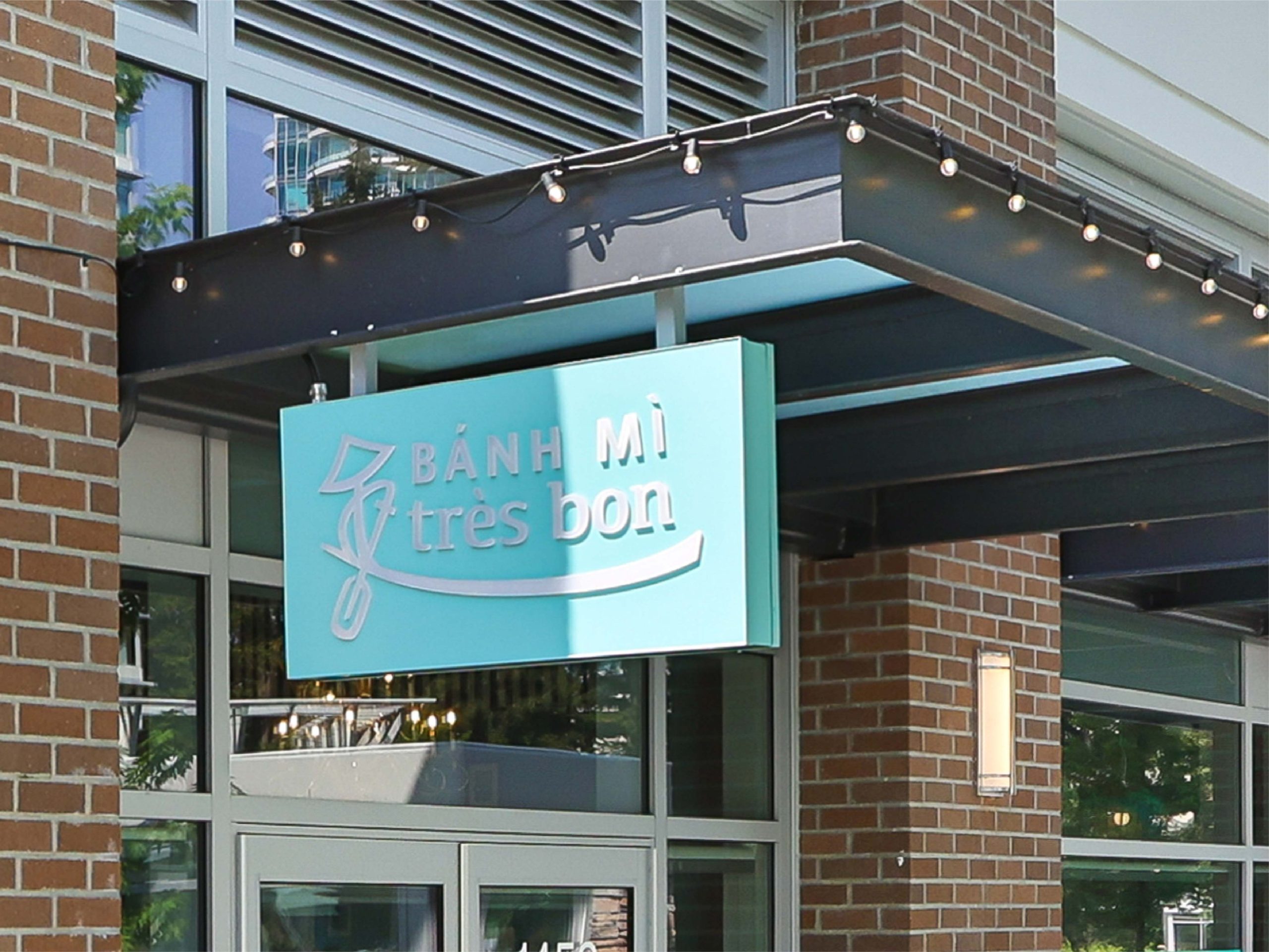
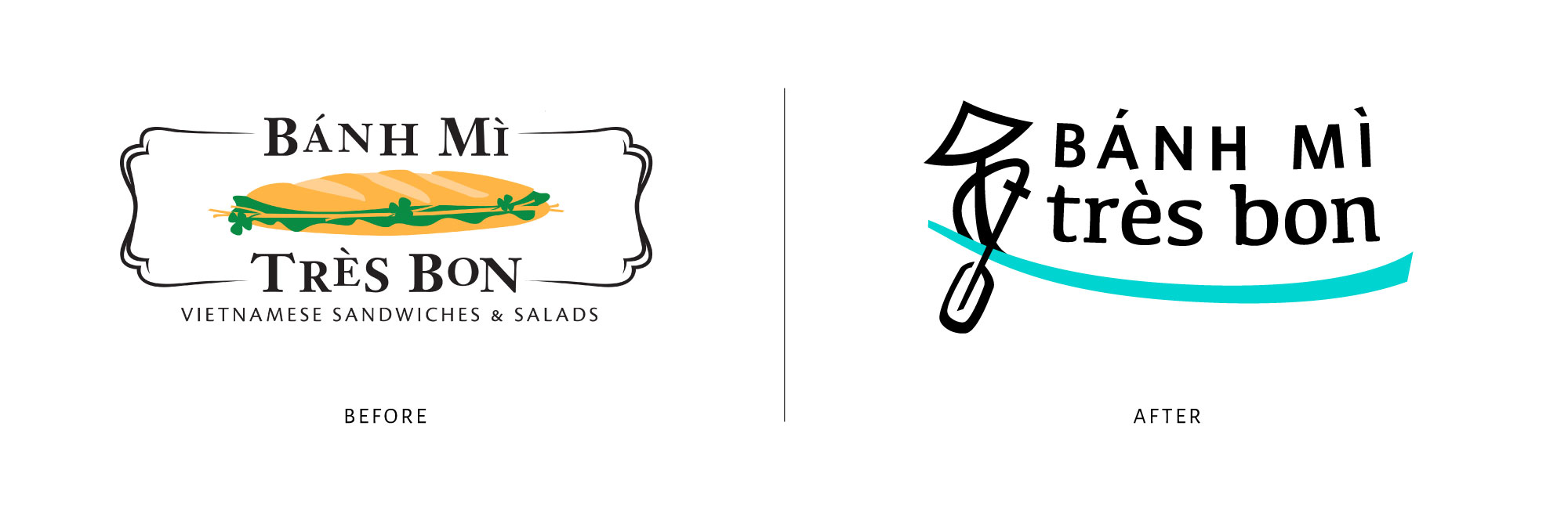
The logo represents the boat which comes with every BMTB Phở bowl, a hand-made piece brought back from central Vietnam. This boat frames the modernized wordmark, a simplified version of the sans and serif combination of the original.
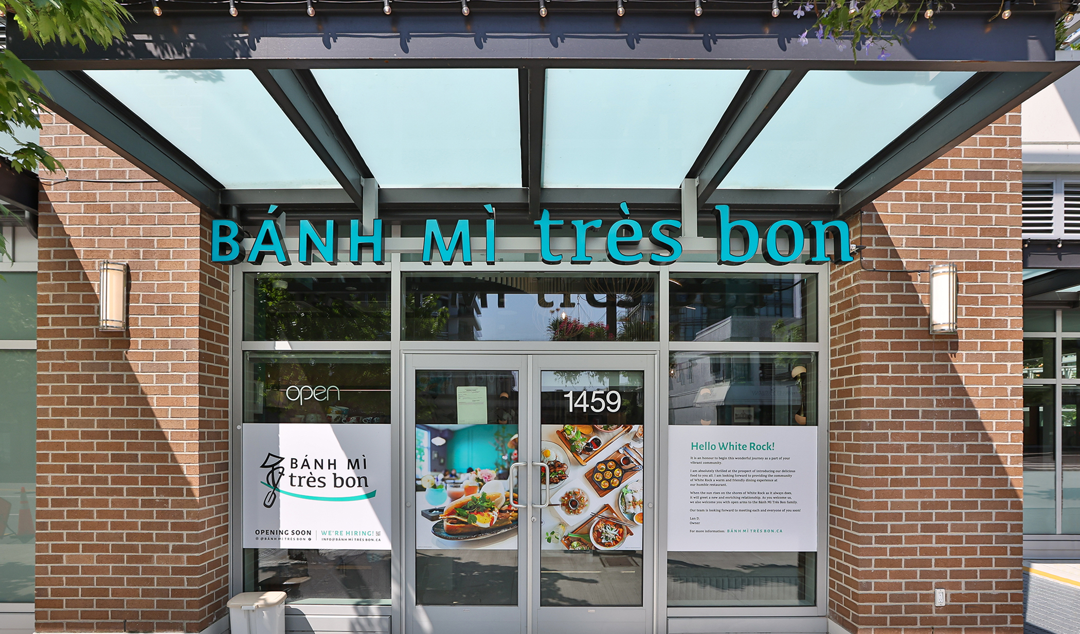
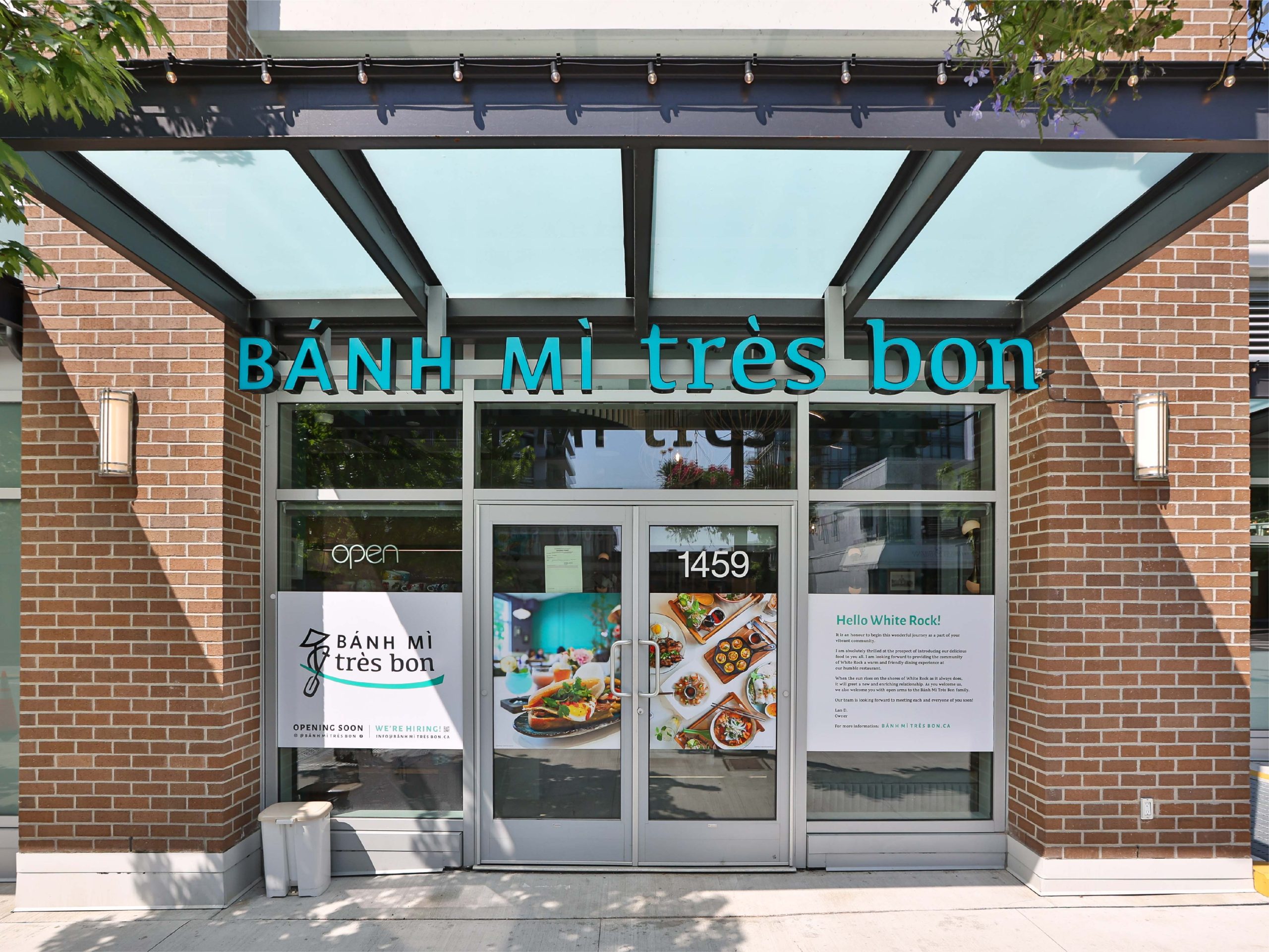
Check out the Wix Website I designed for Bánh Mì Très Bon; and check out one of their locations in Richmond or White Rock, BC.
CLIENT
Bánh Mì Très Bon
DATE
2023
SERVICES PROVIDED
Logo System Design Visual Identity System Wix Website Design Custom Canva Social Media Templates
Before tackling the new logo or brand visuals, it was important to understand exactly the vision Lan (owner) had in mind for this rebrand. This began by outlining some basic aspects that were most important to convey and incorporate into the identity.
VALUES
Integrity Community Presentation Teamwork
PERSONALITY
Friendly Aspirational Passionate Creative
QUALITIES
Innovative Unique Elegant Family-Oriented
We then evaluated the existing presence Bánh Mì Très Bon had, looking to identify what was and was not working. Along with potential opportunities that could be addressed during the rebrand.
When considering the new logo for BMTB, I wanted to find a way to incorporate something regulars would immediately associate with the restaurant. After only five years they have achieved great success and gained many loyal customers who would be critical of the re-design.
Here are 3 early concepts which also explore the use of “BMTB” as a corporate logo would be needed along with the full name version. The primary objectives we outlined together was to modernize the typography and clearly identify as Vietnamese.
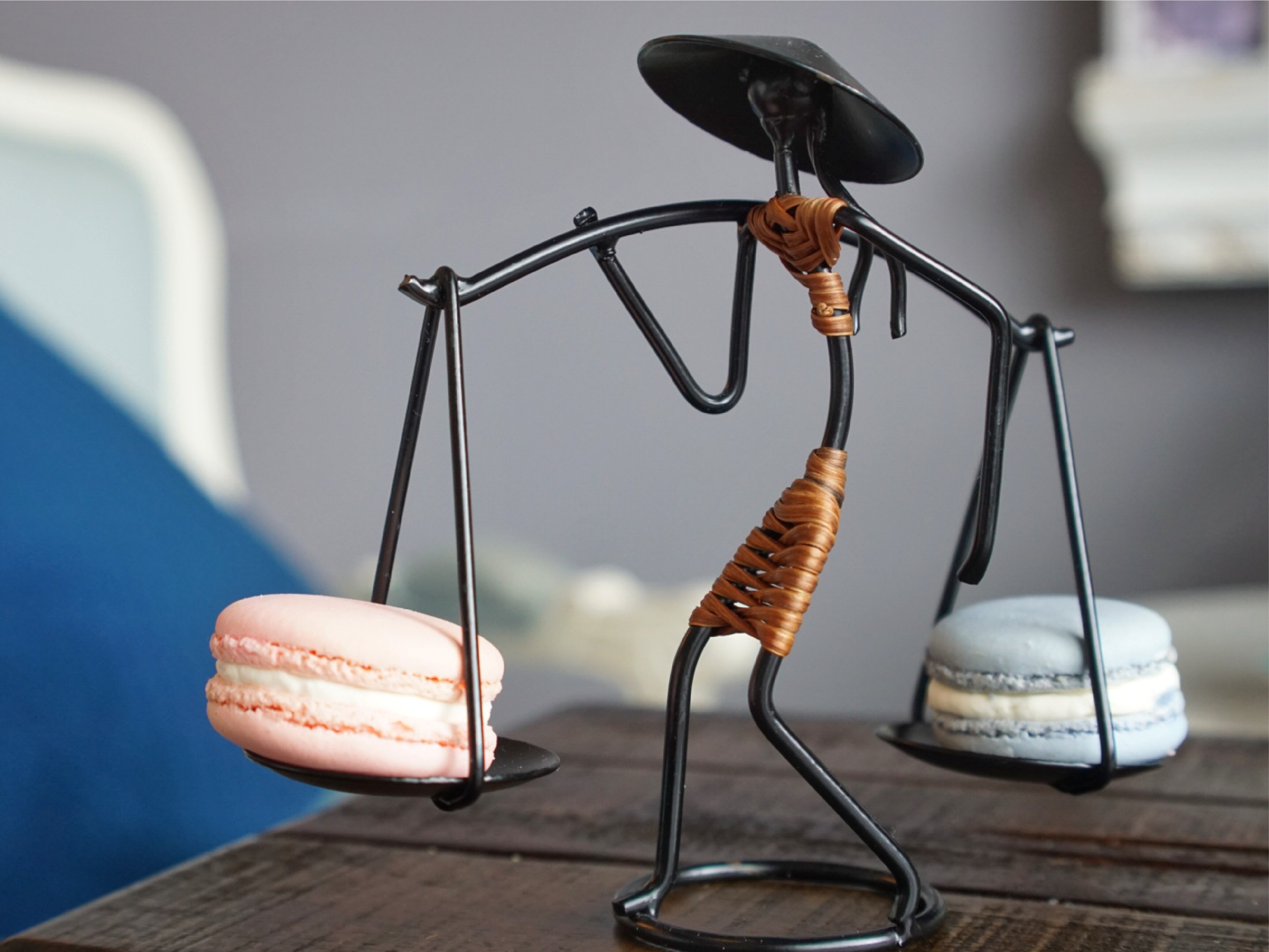
With a longer name this aspect would have to be quite minimal, and shouldn’t distract too much from the name itself. Two items immediately came to mind, these unique hand-made pieces Lan had brought back from central Vietnam.
Matching figures, one carrying two plates with a shoulder pole (used for French macarons), and the second manning a boat that comes with every soup (to serve bean sprouts, fresh basil, and lime).
Between these 3 concepts the choice was unanimous – their Phở is a must try on the menu. Regulars would immediately see the representation, and new customers might pick up the logo correlation after their first bowl.
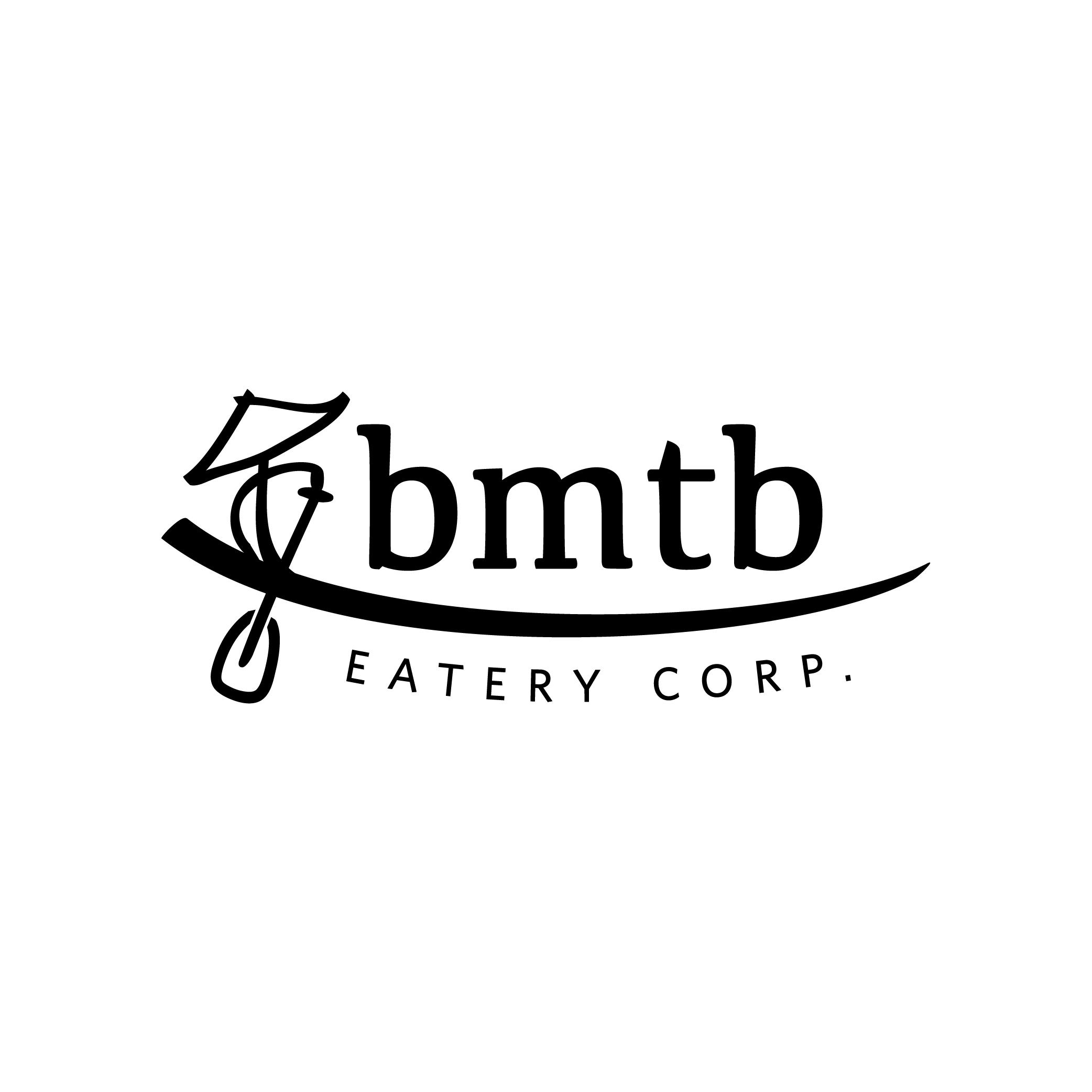
The final logo was designed as a flexible system with a primary logo, wordmark (horizontal or stacked), and corporate version. The manned boat frames the name, Bánh Mì Très Bon, which is set in a combination of sans and serif typeface. This pairing was chosen to help break the name into two manageable parts, and is a modernized version of their original logo.
The colour is directly inspired by the walls in the original Richmond location, which have helped to establish their social presence as a beautiful backdrop to the photo-worthy food.
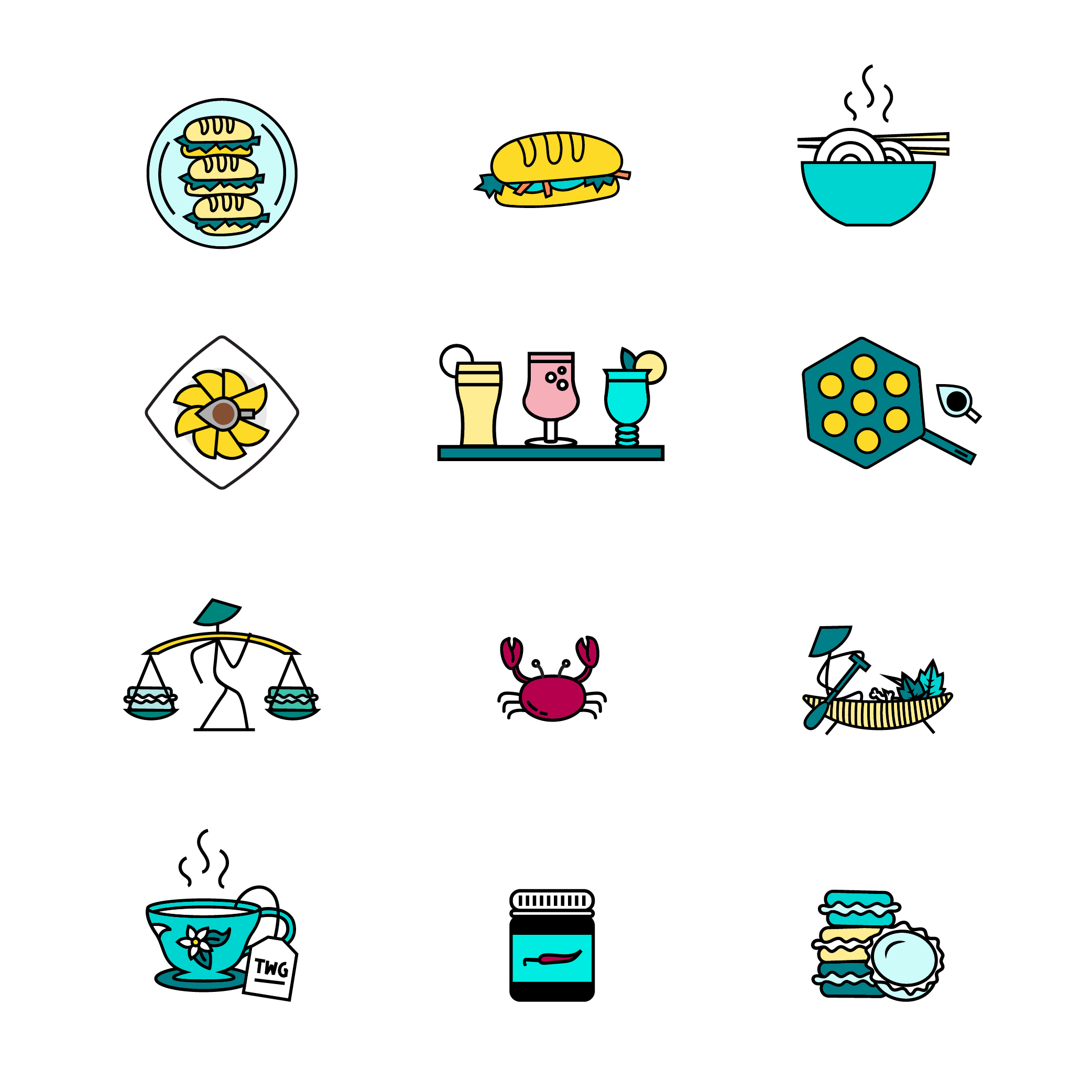
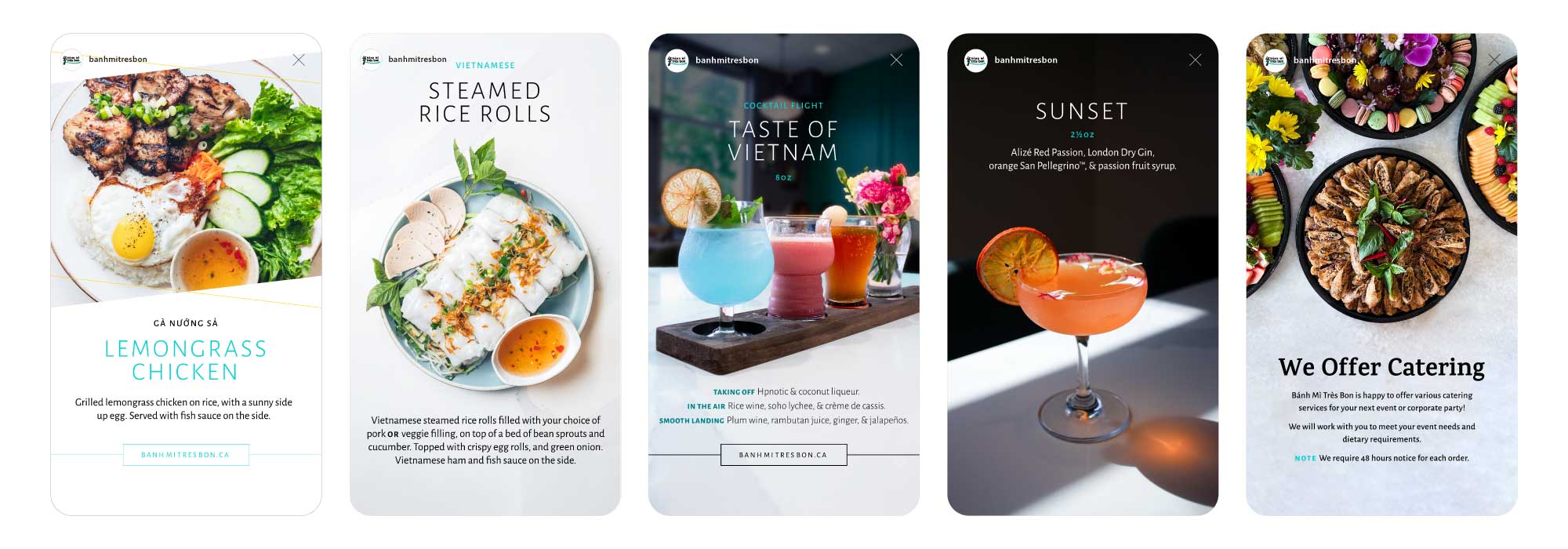
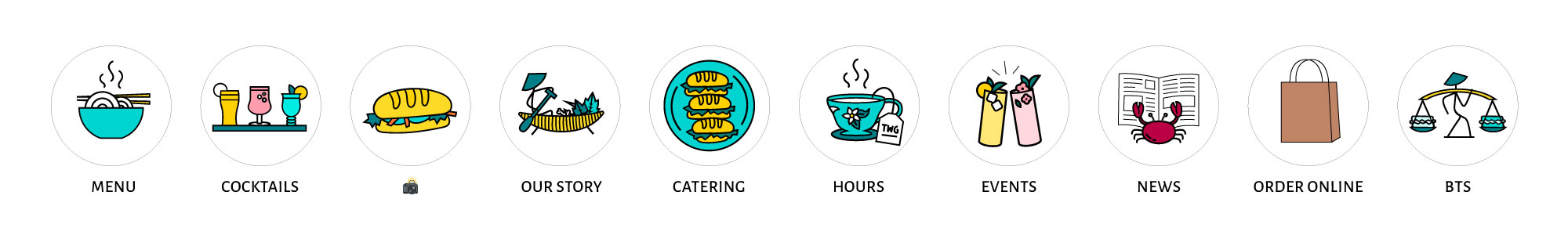
To support the new logo I created custom icons of their feature dishes and custom cocktails, which could be incorporated into the visual identity and used for their menus. I initially began by sketching out how each dish could be considered, aiming to achieve a set that would work together and individually.
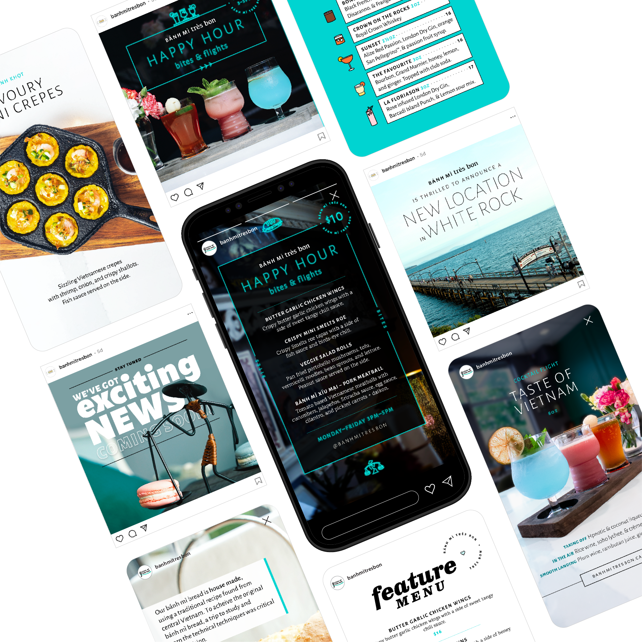
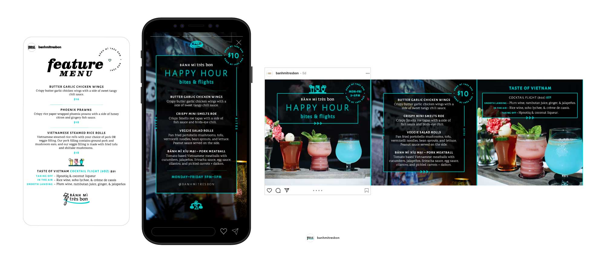
Alongside the brand development we hoped to achieve a social strategy that could be achieved by her in-house staff members, who don’t have any social media experience. To prepare for this it was important to clearly outline as much as possible in their pinned social highlights on Instagram (their primary online presence).
For this I created a series to be released over the weeks following the new logo release, prepared holiday content, and editable Canva templates that can be easily executed by her staff.
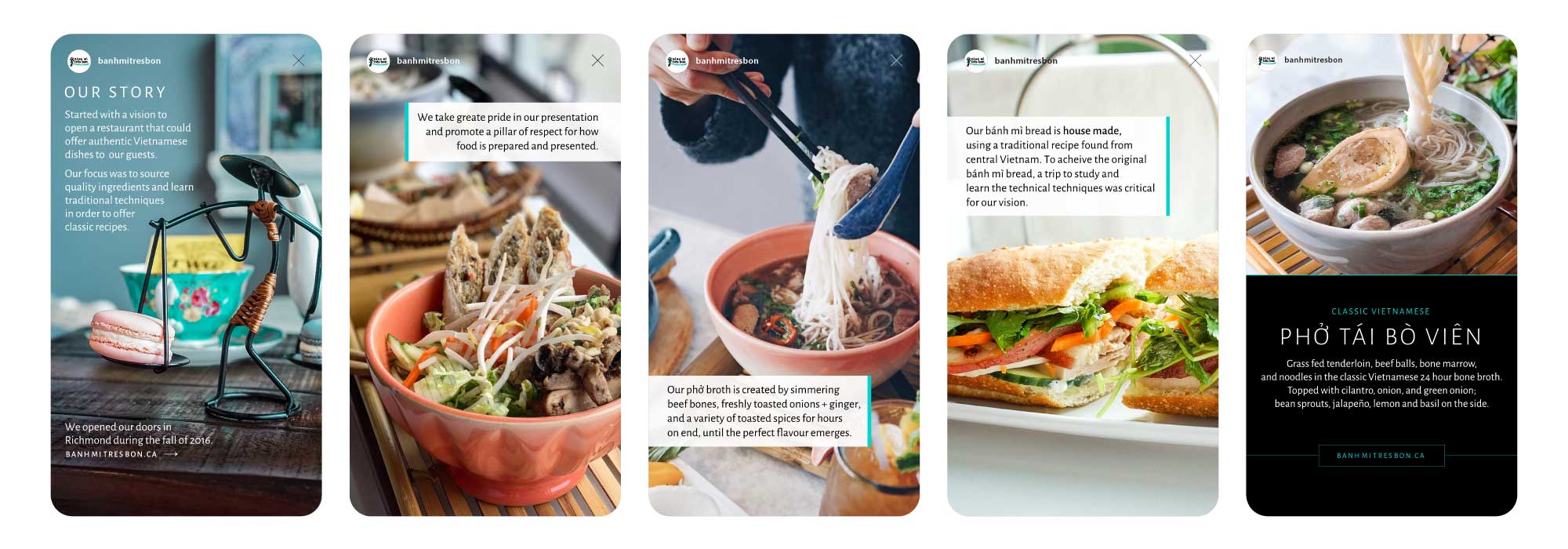
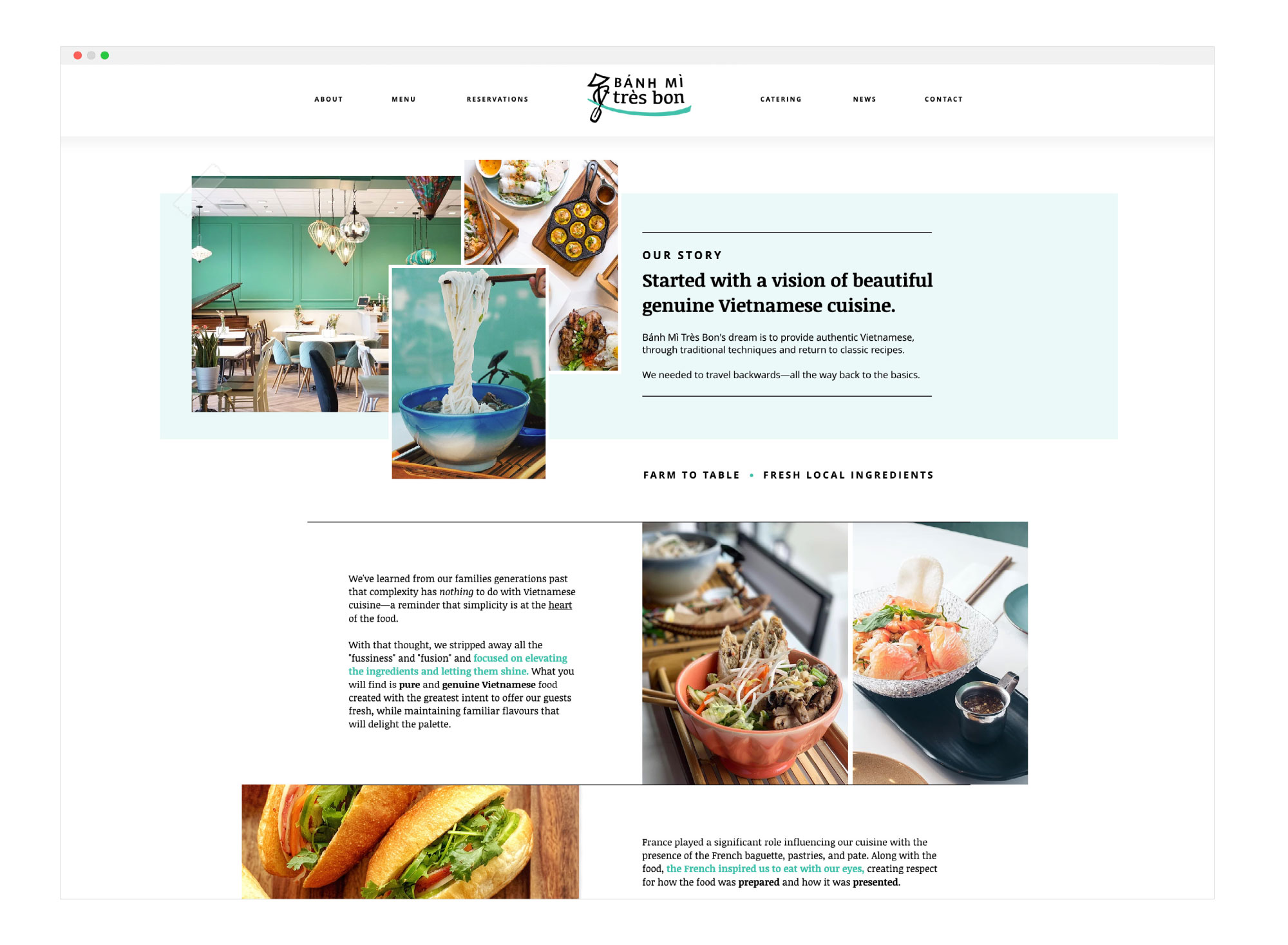
Alongside the new logo release I re-designed their Wix website to incorporate the new branding. This is a critical touchpoint for Bánh Mì Très Bon as customers will look here for the most up-to-date menu offering.