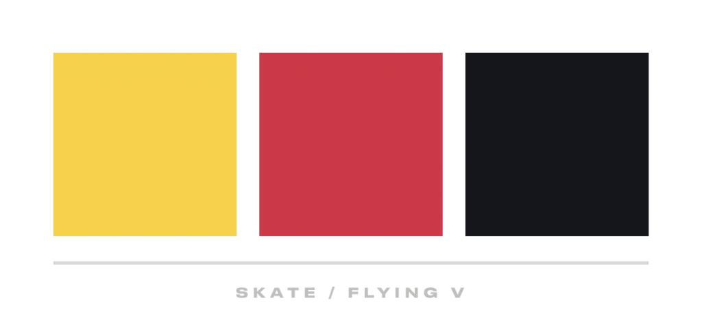
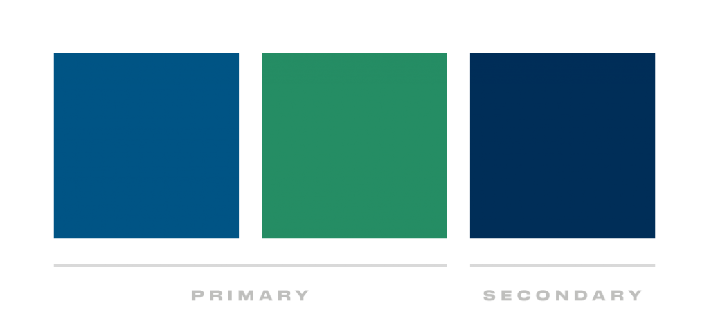
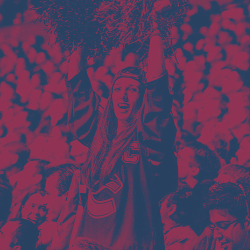
Designing for the Vancouver Canucks 50th anniversary season
Task
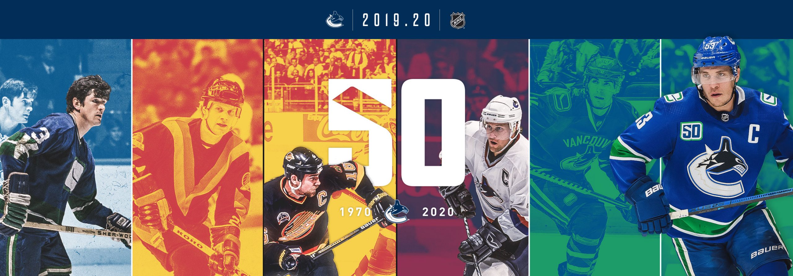
For the 50th season the internal design team was challenged to create a campaign that celebrated the colourful history, jerseys, and historic Canuck moments. Our objective was to create a system that could both celebrate the past players, as well as feature the current exciting team. This would need to be flexible and combine 5 different jersey era colour palettes–that did not look good together naturally.
Outcome
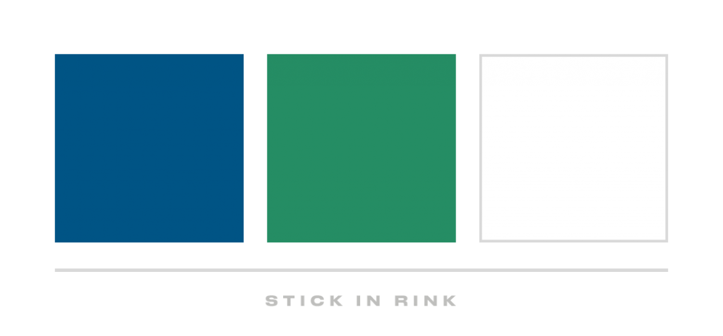
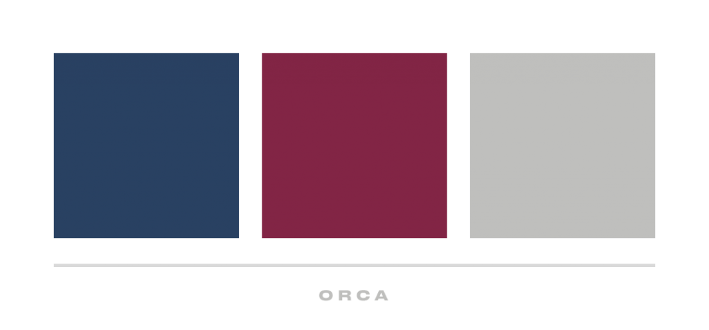
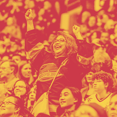
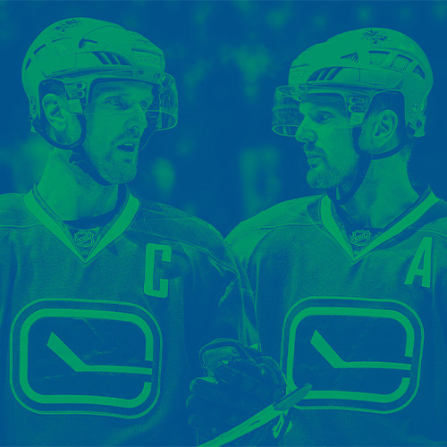
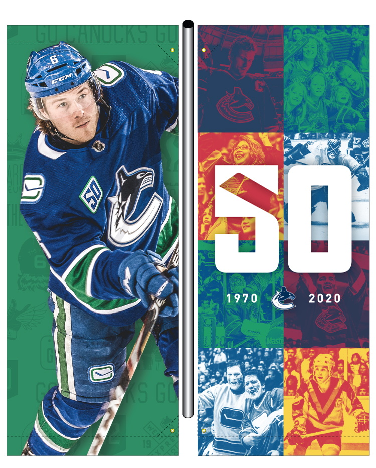
Under the leadership of Leah Browne, we were able to create a colourful campaign system that brought the eras to work together. The campaign celebrates the jersey history by utilizing a duotone background treatment, in an updated colour palette that distills the eras down to 10 colours. Which is still a lot–but the least we could get away with.
Results
It was an incredible season, where on average the arena was sold out! This sadly came to an early end due to the Covid–19 Pandemic. Regardless of how it ended, it was a completes success and I’m proud of everyone who was a part of the season.
To get started we were all assigned various components to focus on, depending on strengths and interests. I was assigned to finding the typeface options.
From the options I found, we ended up using Dharma Gothic by Ryoichi Tsunekawa and Druk Text Wide by Berton Hasebe. Together this pair could be used in a variety of layouts providing the drama we were looking for, and had more weights than you can imagine.
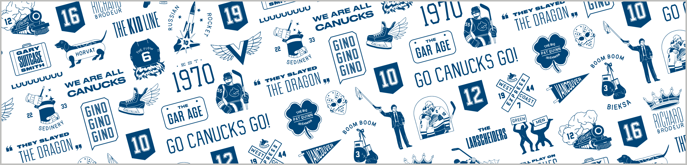
A huge component to figure out was the colour palette as the original colours looked horrible together. With 5 different jerseys, we were talking about a lot of colours to represent. It was important to try and embody each era, to not exclude any generation of fans.
Kailey bravely took this challenge on, and killed it with the final colour system. She was able to combine certain eras and the final palette is comprised of 10 colours.
Together we worked out a system of various image treatments, utilizing a duotone effect for the retro eras.
By tackling the campaign as components, we were able to create the basic elements to comprise the system quickly and efficiently–necessary as we had very little time to develop this. The next step was combing all these elements together, as we would need to design compositions that represented all the eras.
The campaign elements in this section were created together by the team listed in initial summary.
All work shown from here on out has been created (start–finish) by myself.
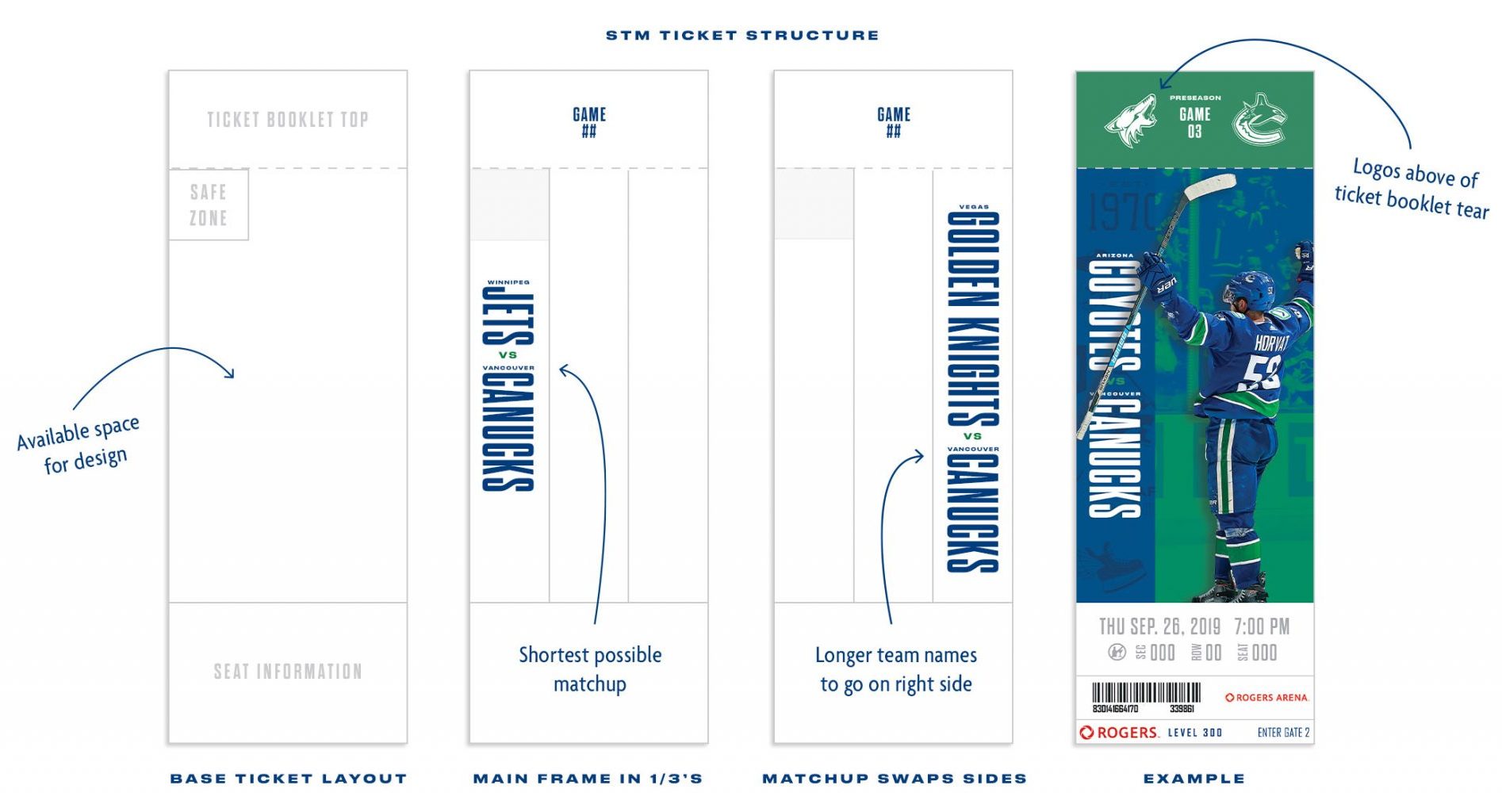
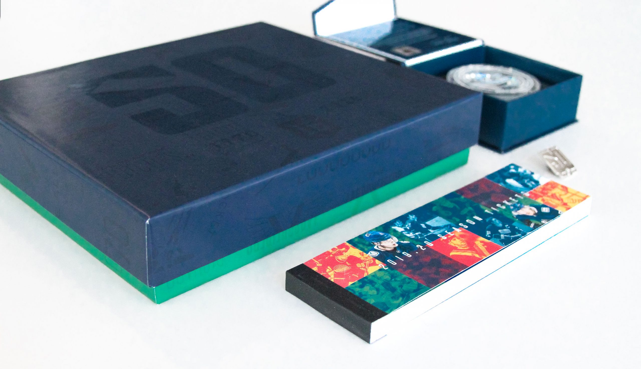
The first project to be designed featuring the new seasons campaign, was the members ticket box, which is sent prior to the start of the season. I was assigned to this project, which also included being project lead for the actual ticket design.
Prior to the season start, season ticket members were gifted a special box for the 50th anniversary.
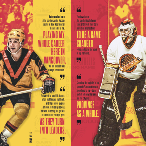
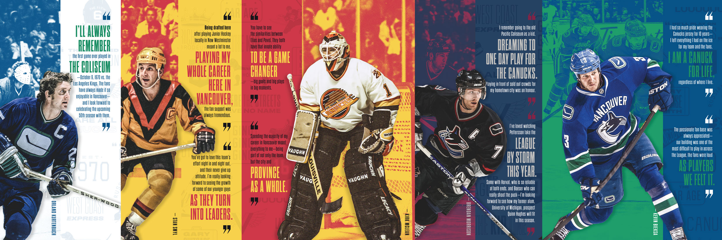
One component of the members’ box was a booklet to breakdown the season. Above is a two page spread from this booklet, which was reserved to feature quotes by famous players of each era; one example of how to combine all the colours in one composition–something we had yet to quite figure out.
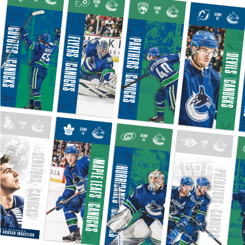
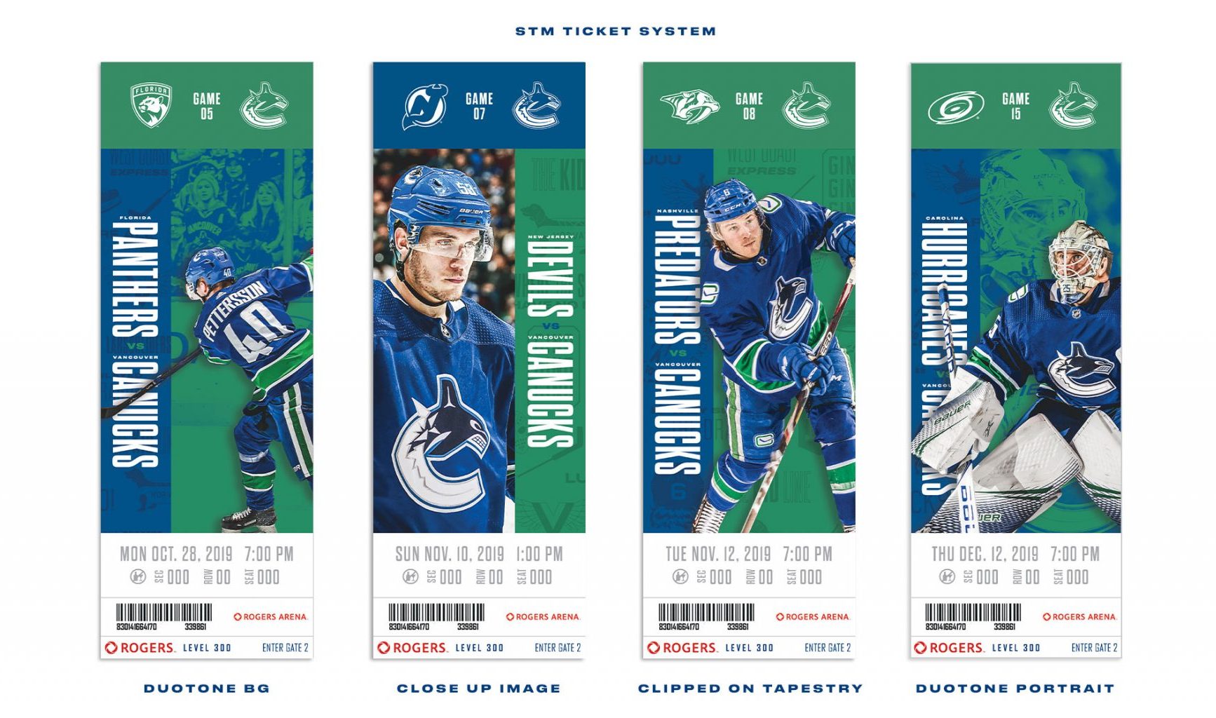
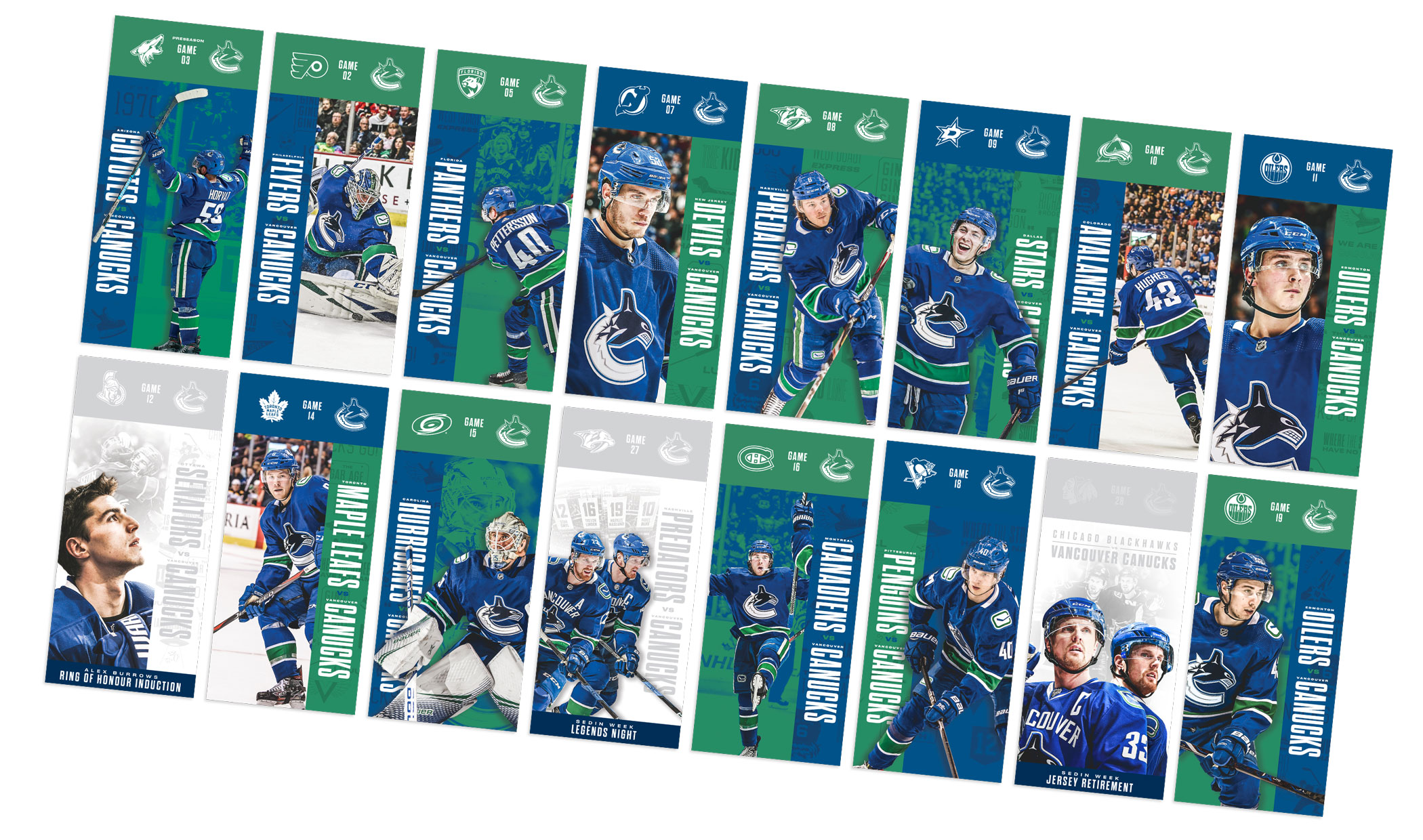
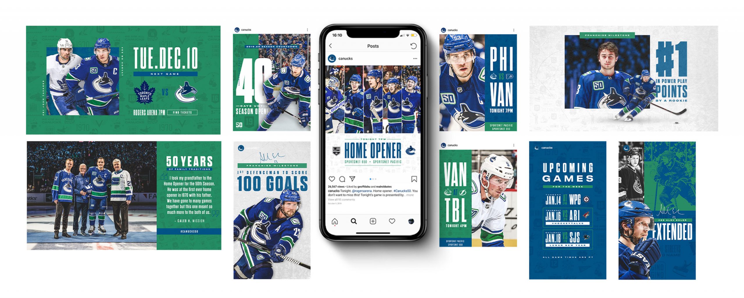
For the tickets, the objective was to have the players as the main focus, and the match-up came secondary. With 41 home tickets, the key is consistency without a feeling of repetitiveness. The final ticket structure has the live area divided into thirds, allowing for the flexibility to inverse the layout. For the regular games there are 4 different designs layouts, as well as special theme night tickets.
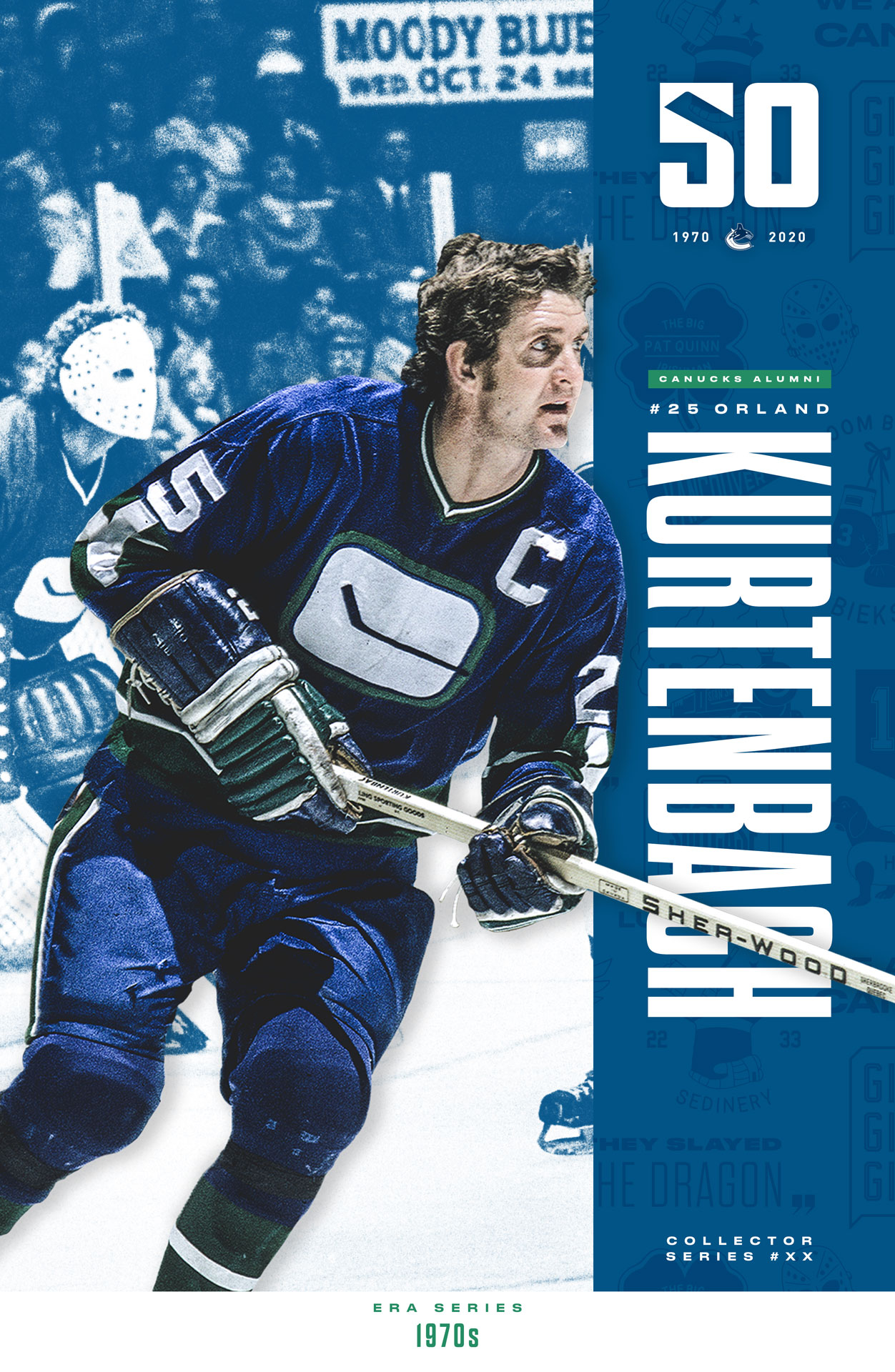
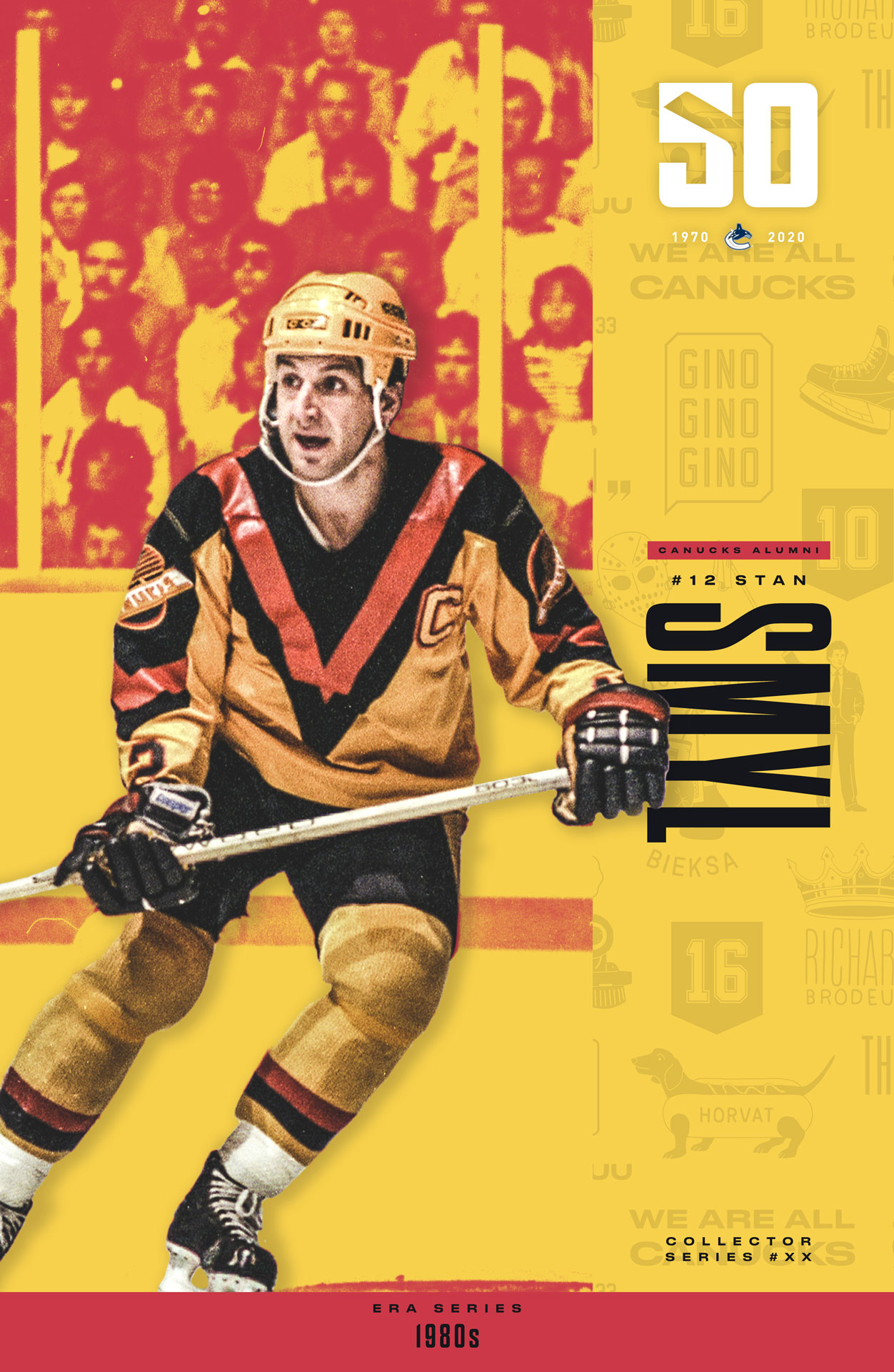
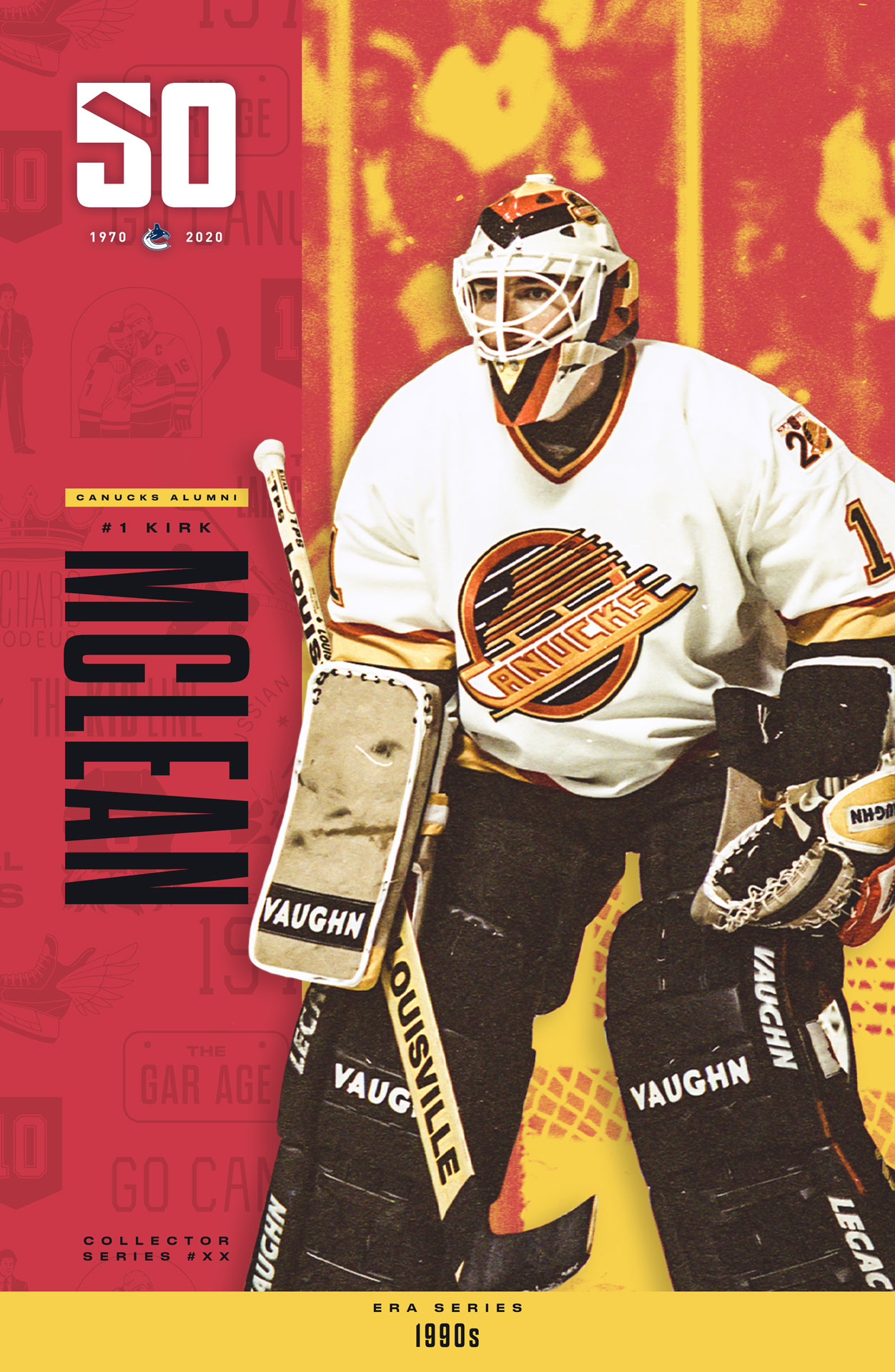
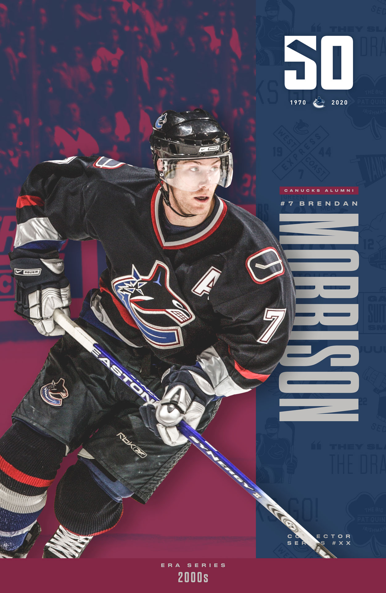
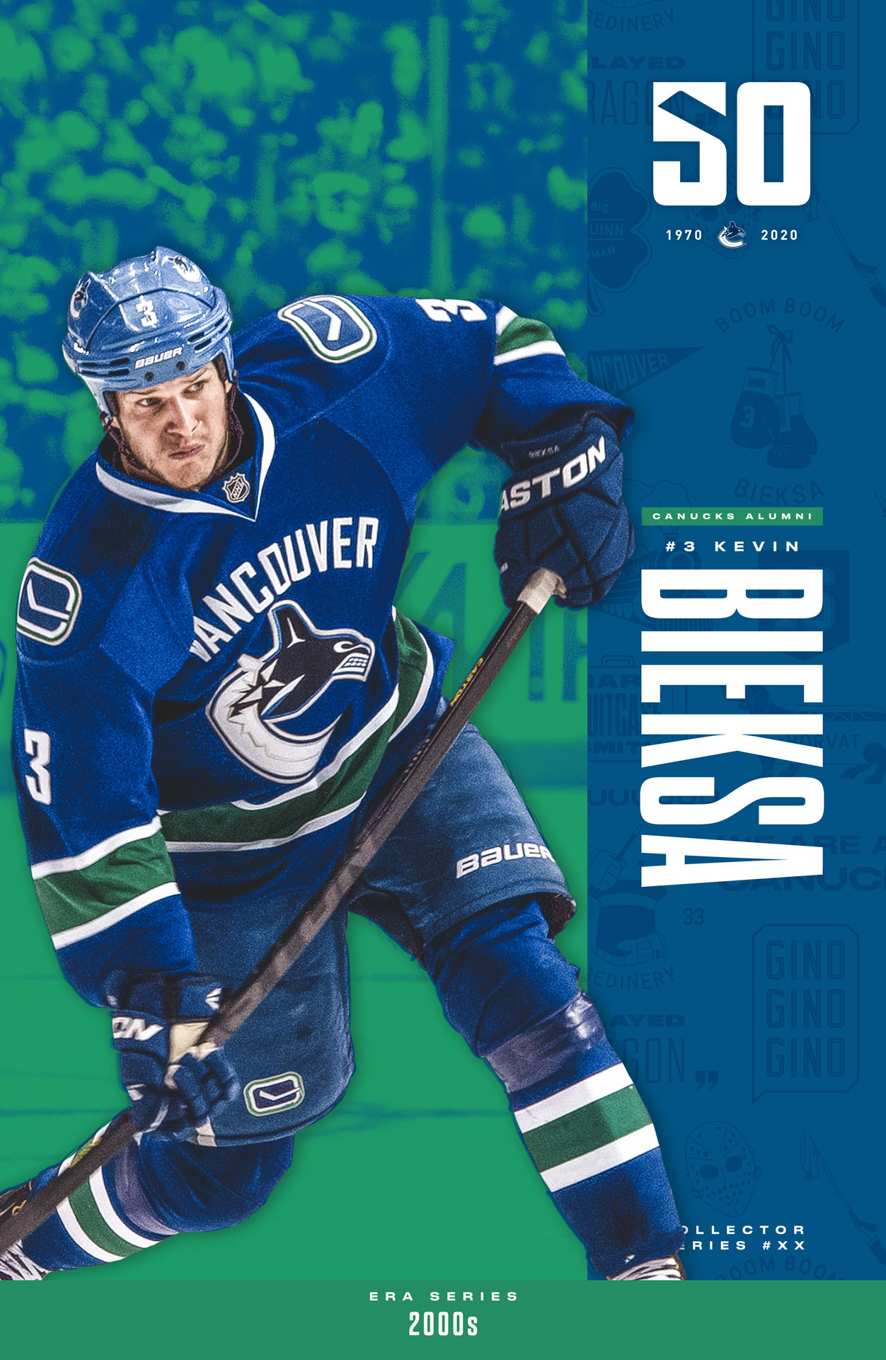
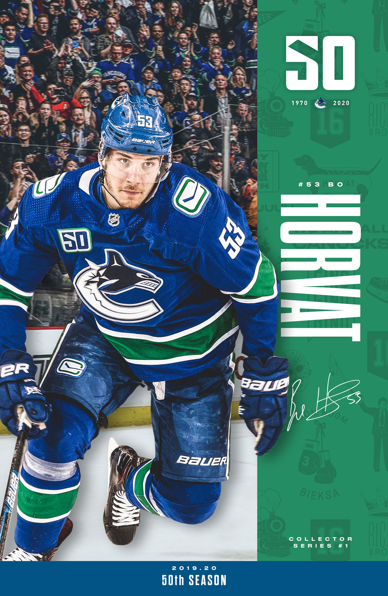
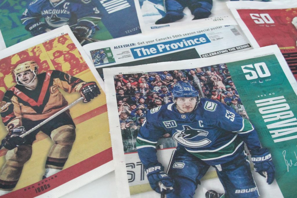
Another fun assignment: a player poster series, that would be sold in the Team Store. This would be a massive collectable series, featuring players of each era. For this I designed the first set shown below, which would be executed throughout the season by the intern of the time (Joanne or Hillary). This turned into a partnered project, where The Province Newspaper featured these as their cover every game-day– pictured below!
Throughout each season we supported the video content and social media teams, with Photoshop templates that could be used for regular game-day content. In addition to typical season events, the design team must plan for potential outcomes, as we were not often privy to updates prior to the public. This required us to work quickly and be flexible with content, as things would change rapidly at times.
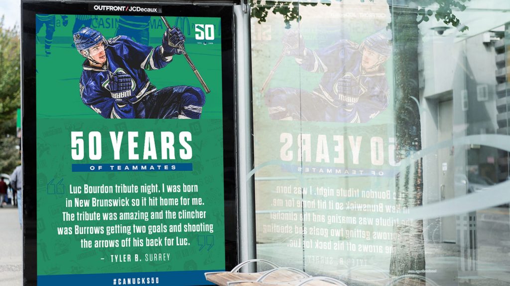
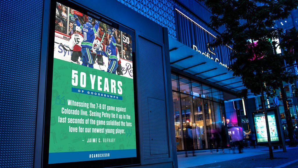
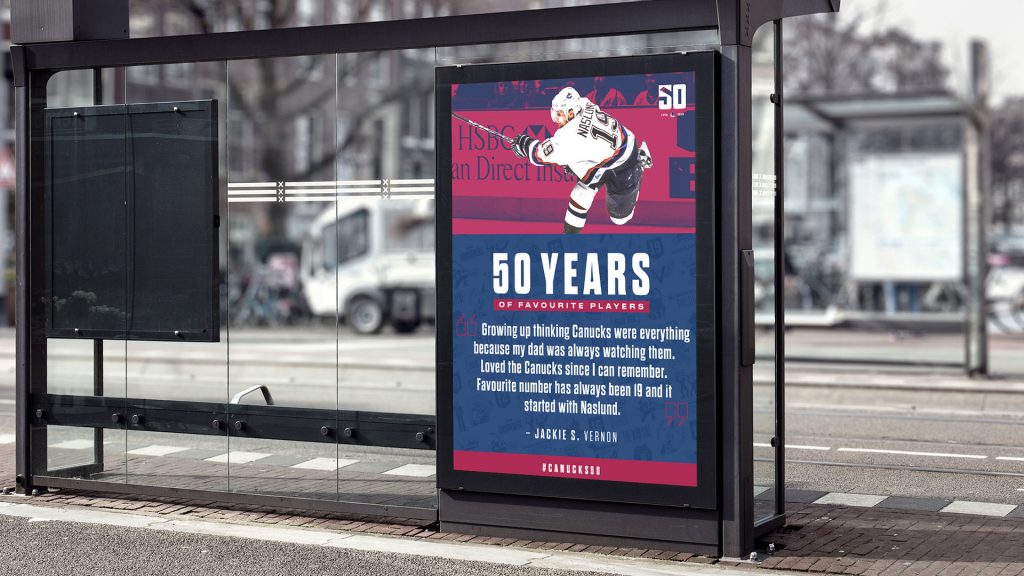
A fan engagement project for the 50th season, involved asking fans to submit their favourite memory of the Canucks. These would be shared on the Canucks Instagram account, along with some bus-stop signs around the city. I created Photoshop templates for the social posts, and the top quotes were featured at local bus-stops.
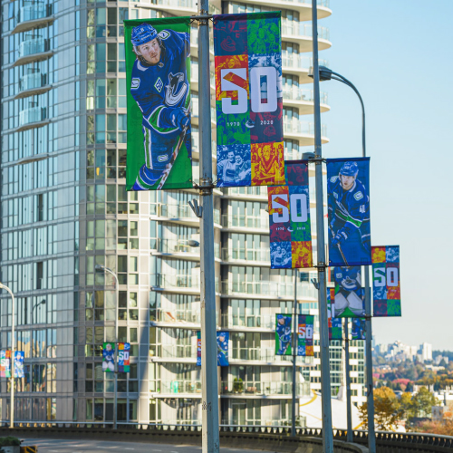
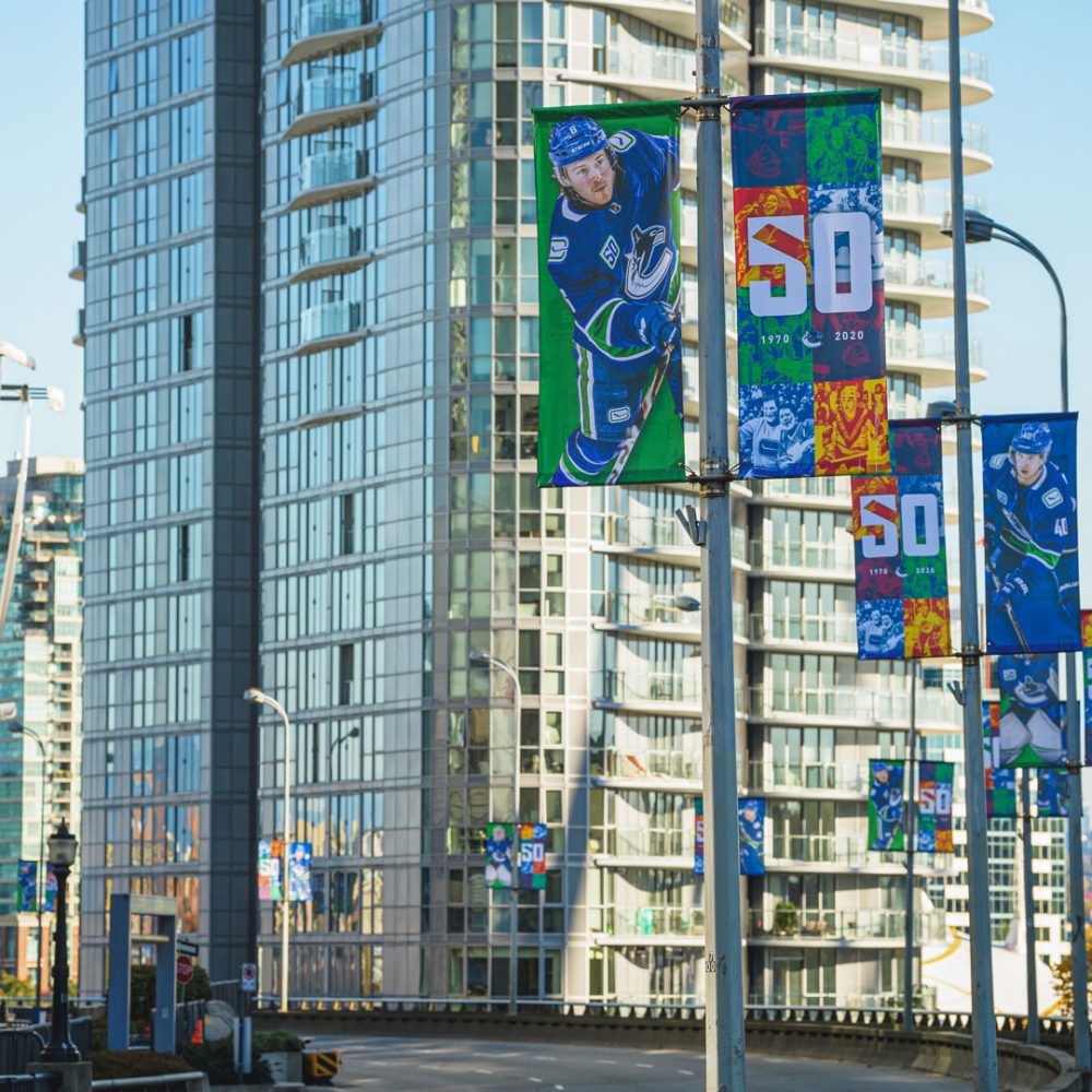
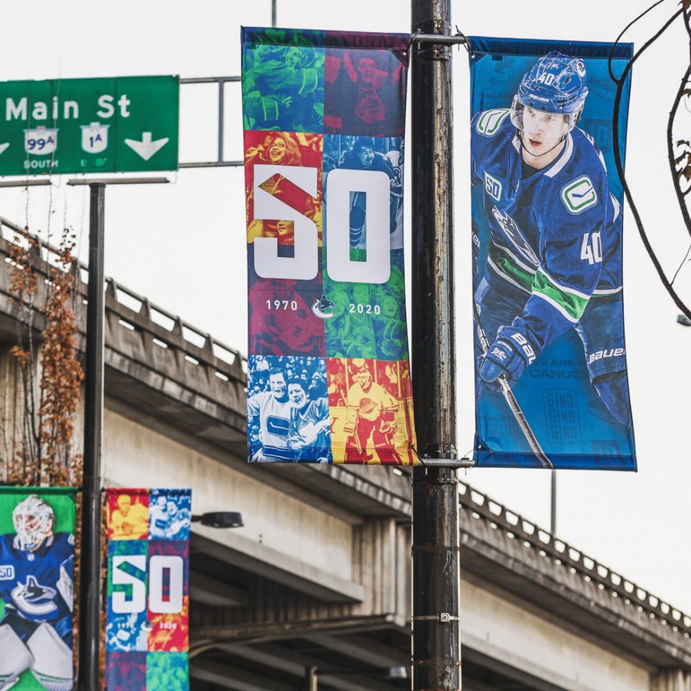
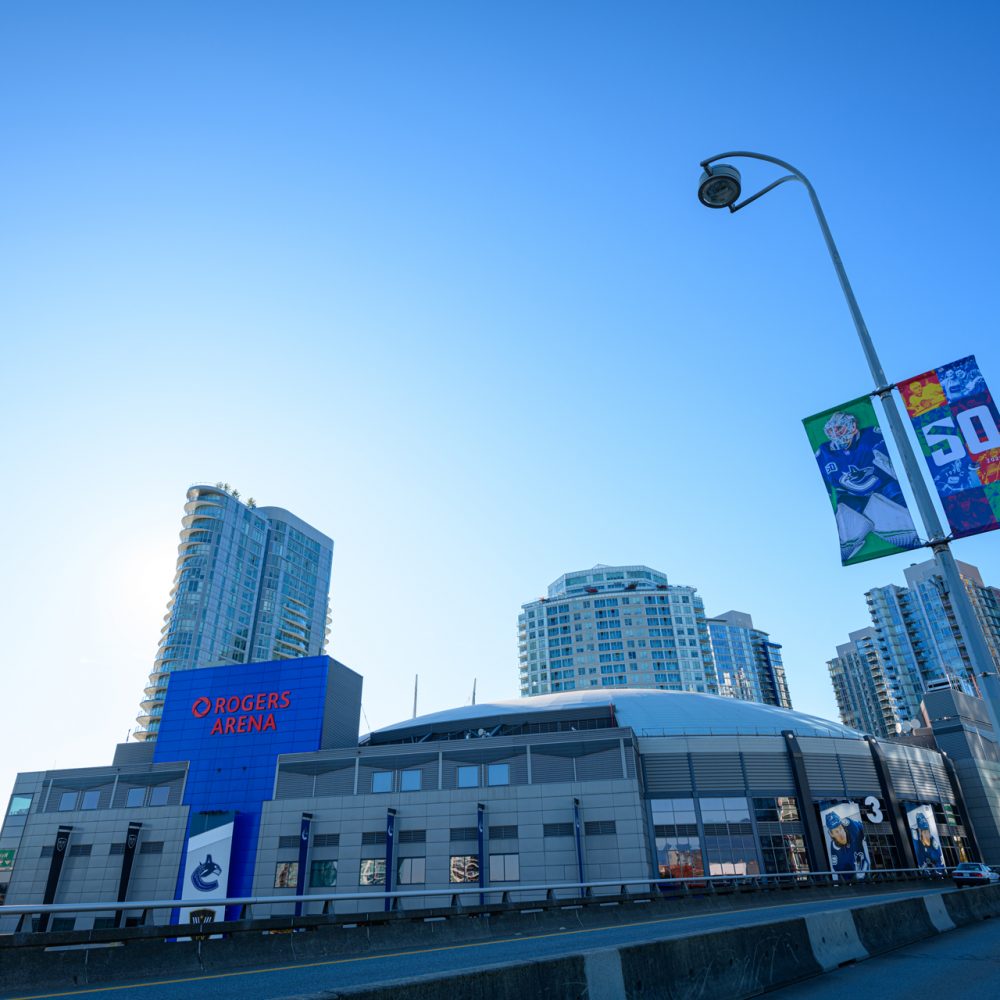
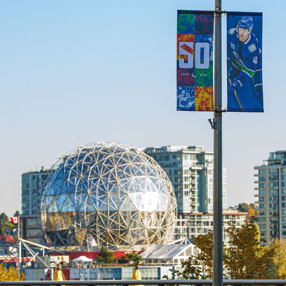
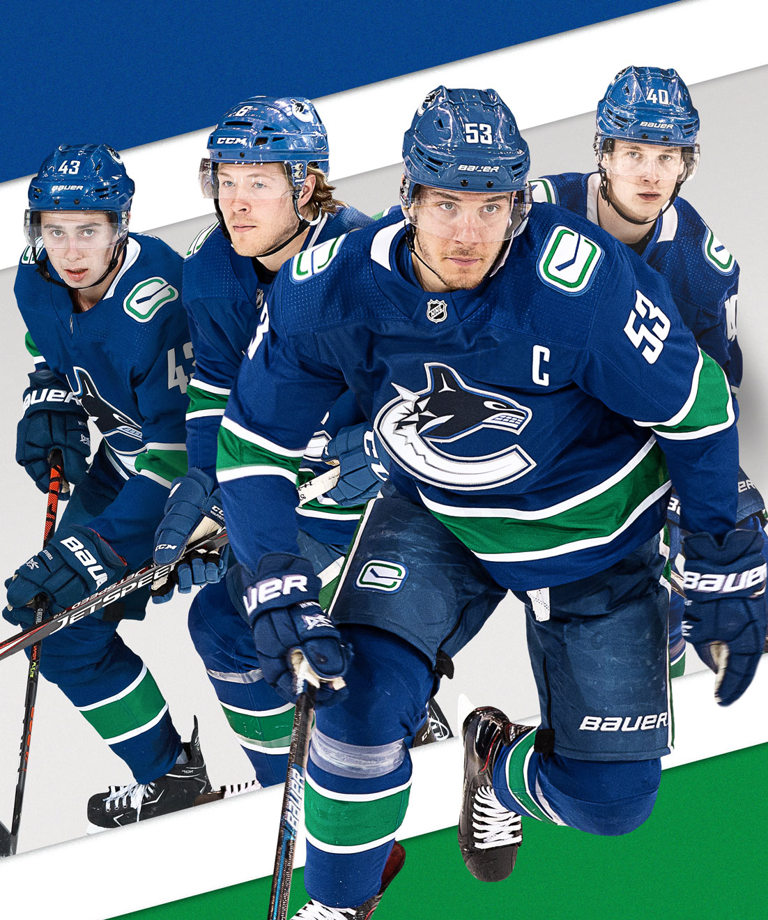
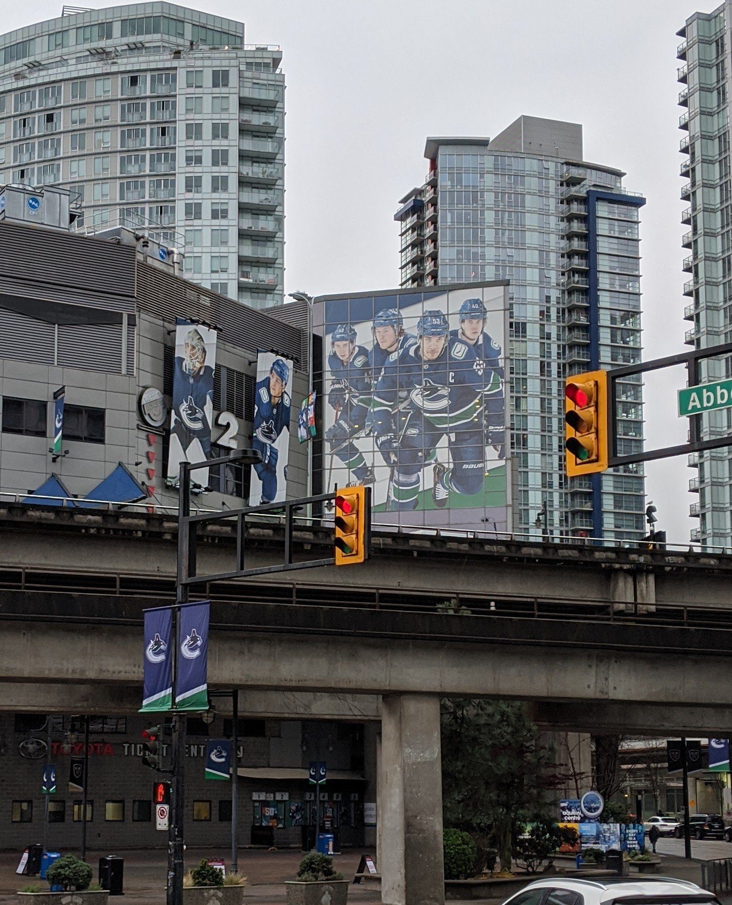
Now if you’re still with me, the final piece I’ll show you from my work during this season, is the Georgia Viaduct window. A huge honour to design, along with the updated gate banners (seen to the left of the window) surrounding the arena. This was an interesting challenge, as I had to account for all the gaps between the windows, as this vinyl would scale 2 ½ floors. This needed to be a simple evergreen Canucks design, that could last multiple seasons if needed.