Creating a playoff campaign during the pandemic for the Vancouver Canucks
TASK
The National Hockey League (NHL) had announced a “bubble” style playoff format to complete the 2019.20 season, and while this year would be different due to the Covid–19 Pandemic, the games were on. I was assigned as the lead designer to create the playoff logos and establish the visual campaign system.
OUTCOME
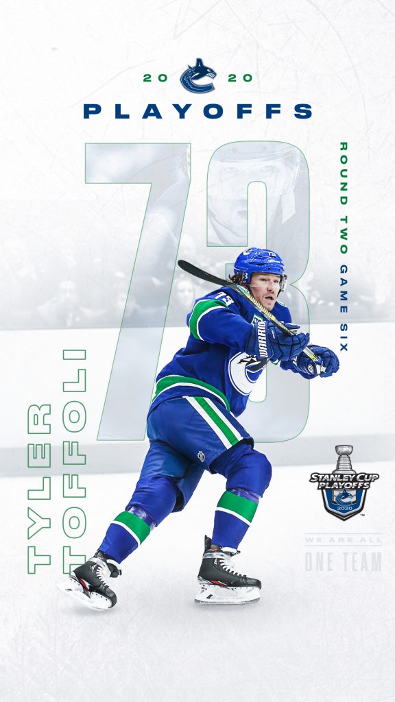
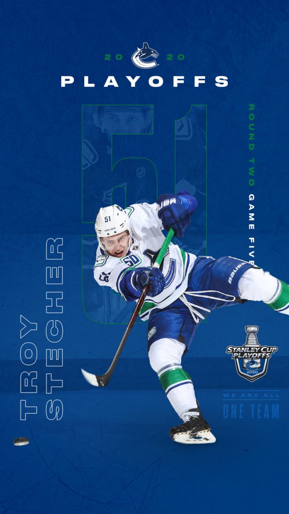
The final campaign is sharp, hyper-focusing on the featured players while the fan-less arena fades from view. The colour palette returns to a crisp blue or white treatment, to follow the colourful style used for this season, which happened to be the 50th anniversary. The typography is bold and striking, utilizing the content as an opportunity to create an energetic addition to the graphics.
EMPLOYER
Canucks Sports & Entertainment (CSE)
POSITION
Graphic Designer
ASSIGNED TO
Playoff Logo Design Playoff Towel The Province | Player Cover Series Social Media
All work shown was created (start–finish) by myself, with feedback from the Design Manager at the time, Leah Browne.
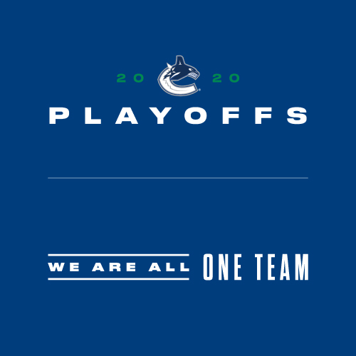
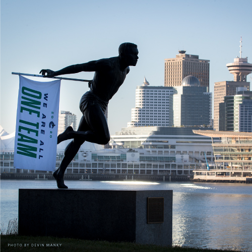
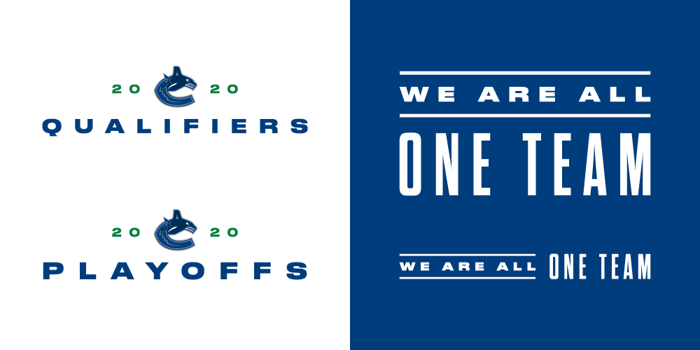
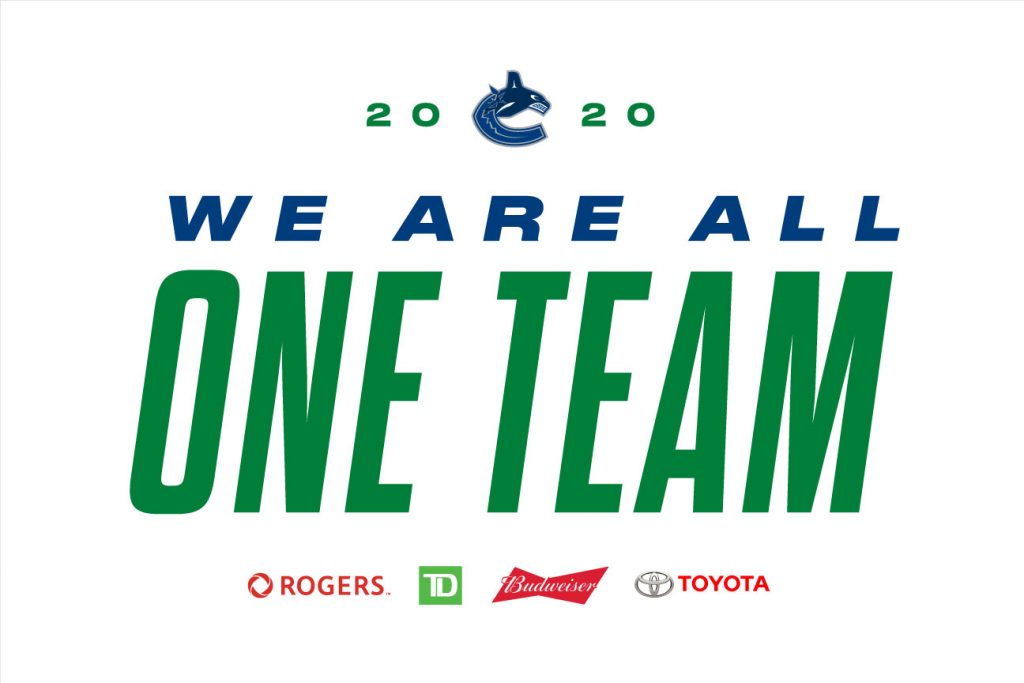
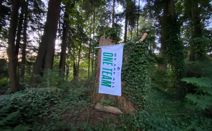
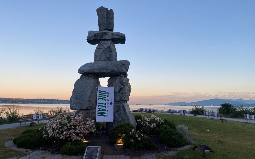
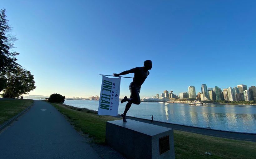
The first task I was assigned was to create a Canucks Playoff logo (for internal use with corporate partners,) and a wordmark for the tagline. The messaging was provided by the marketing department, and focused on the community as whole, coming together stronger than before. Hockey is back, uplifting, and exciting; with a team the city could rally behind together, while apart.
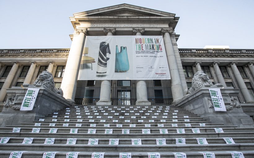
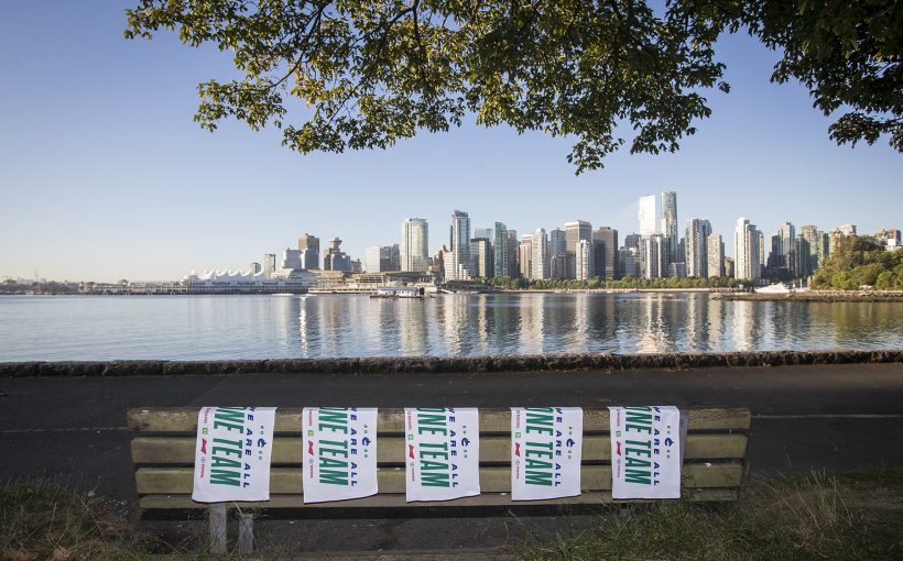
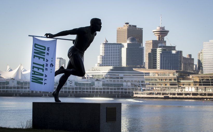
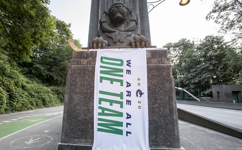
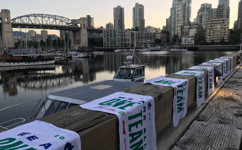
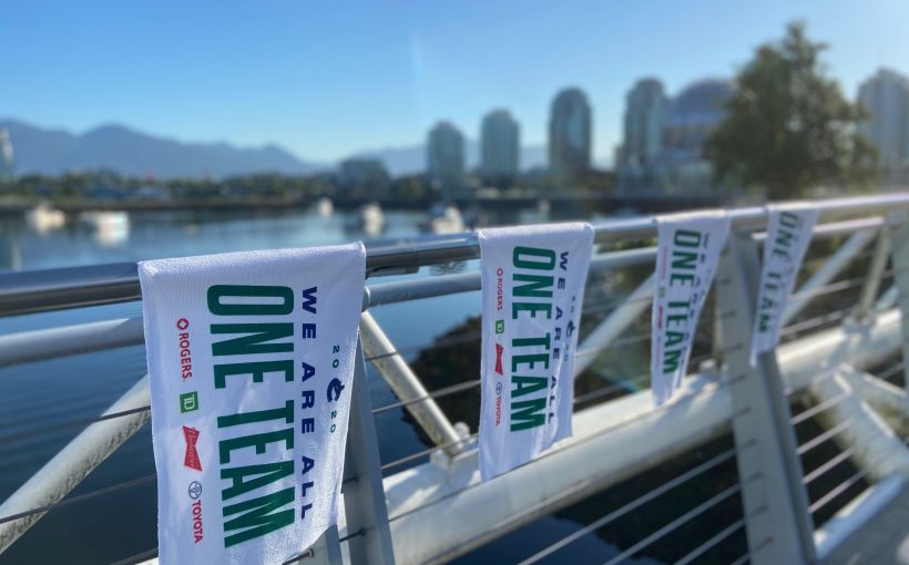
Next was the playoff towel–yes we were doing this despite the lack of fans at games. They would still be used for marketing and fan engagement give-aways. For the towel design I wanted to keep it simple, and utilized the tagline as the focus, a requirement along with the corporate partner logos. The quality of these towels are not historically fantastic, so a simpler design would likely look better than a complicated one.
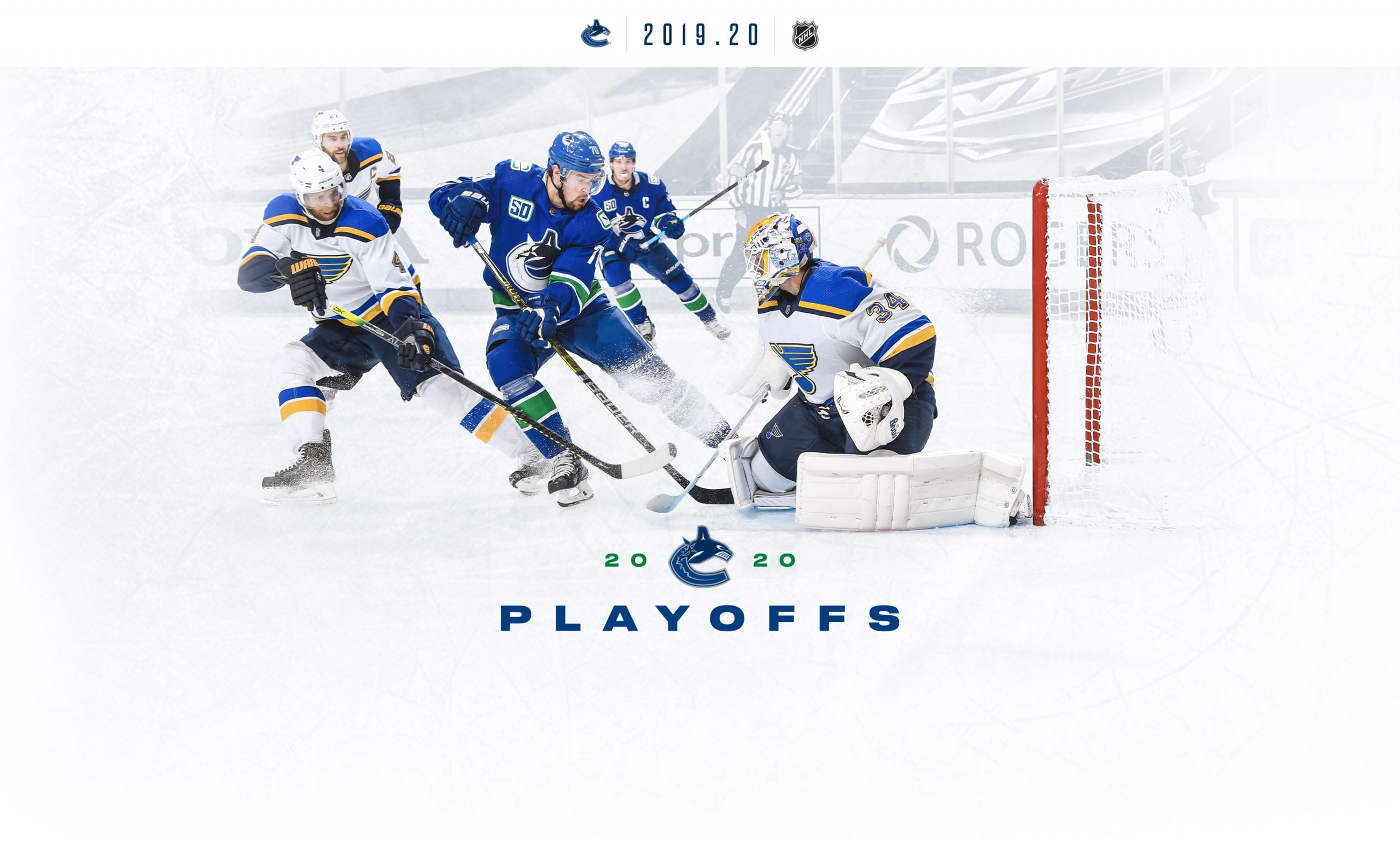
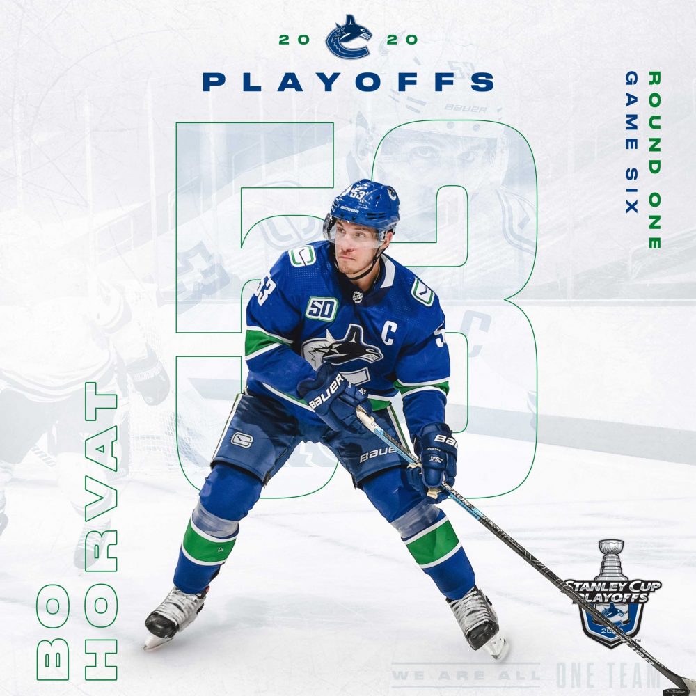
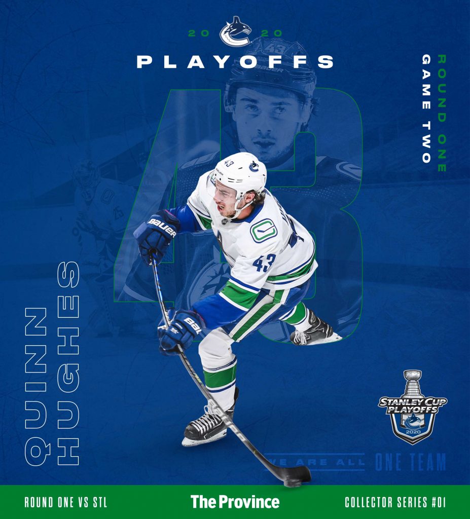
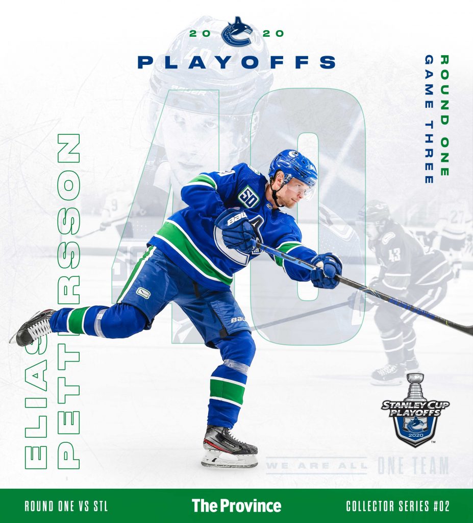
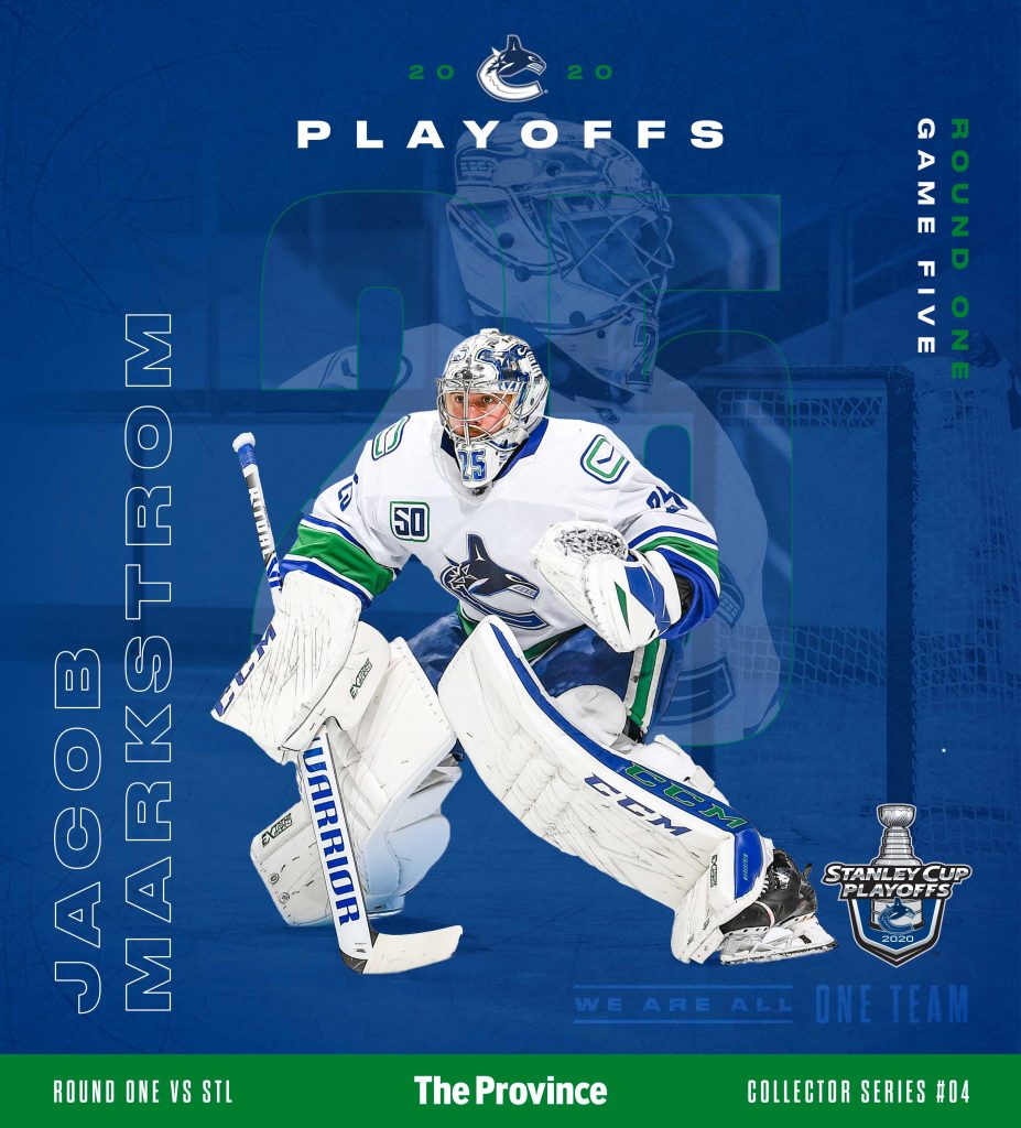
A major partner for the playoffs was The Province newspaper, and I had the chance to design a cover series that would be released every game-day. Each game a different player would be featured to create a collectable series, and should be designed as a whole.
Check out how I re-sized this design for mobile in the speed lapse video below ↓
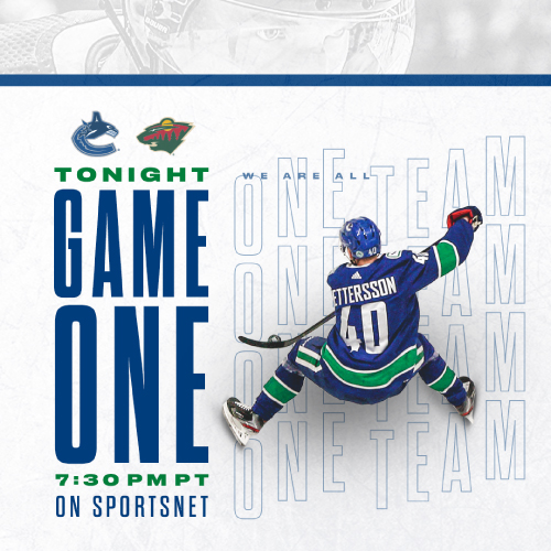
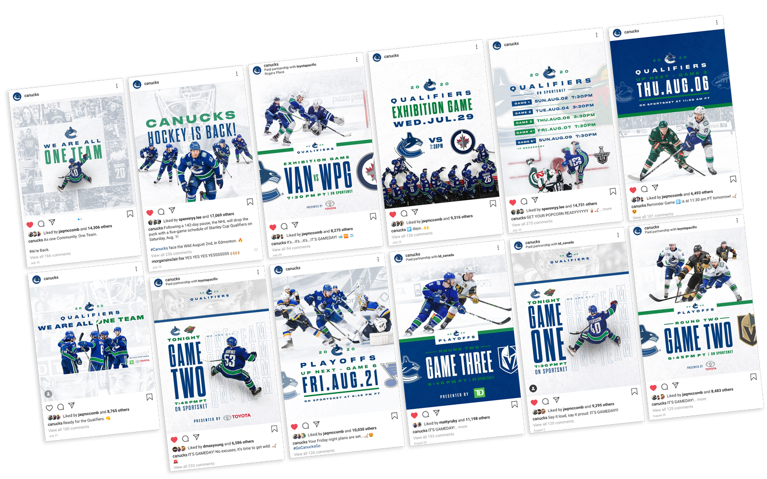
Due to the pandemic the social media accounts became a priority as fans would be watching and engaging exclusively from home. To prepare for this I needed to create a system that would be flexible, and could be executed quickly due to the short notice nature of a live event series. It would be design on the go as the game results came in, and prepare for possible for potential scenarios.