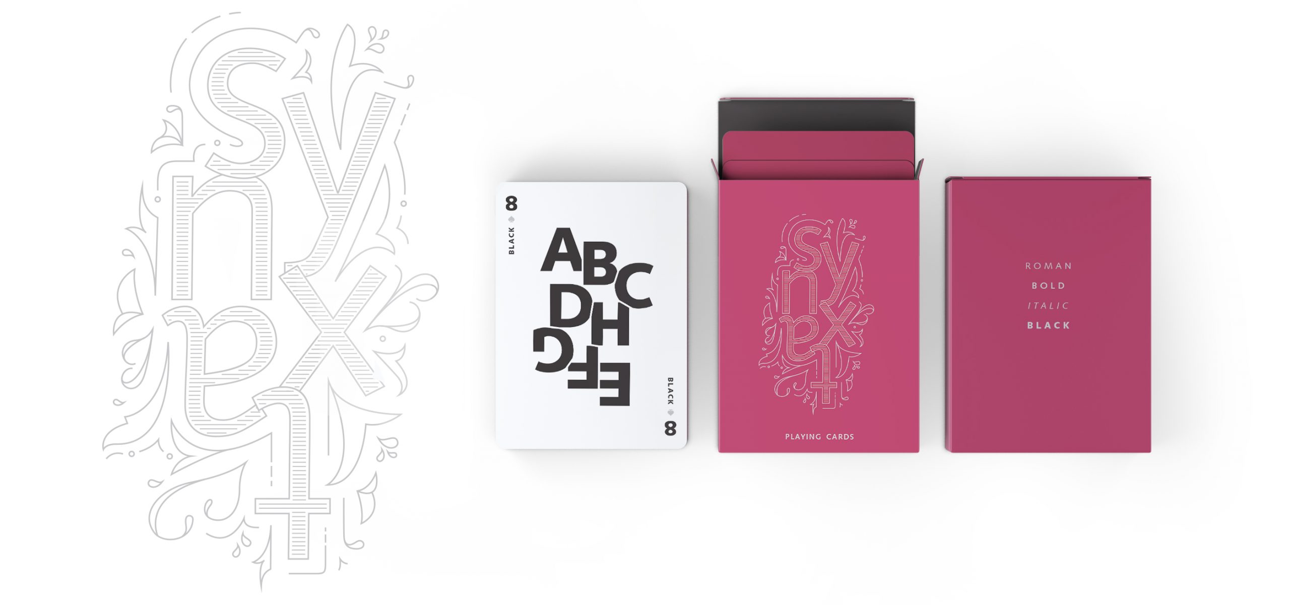
A fun school project during my time at Emily Carr, for a typography class. The assignment, create a promotional piece for a type foundry.
OUTCOME
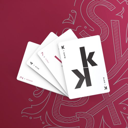
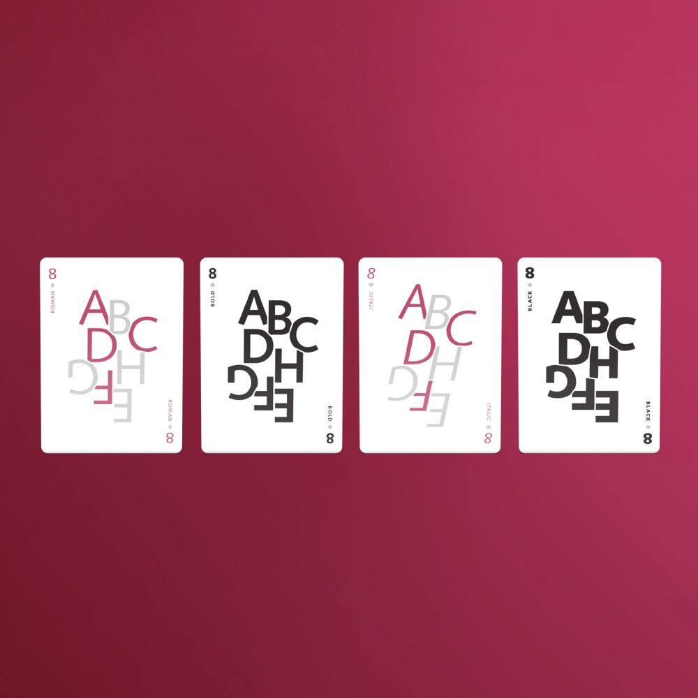
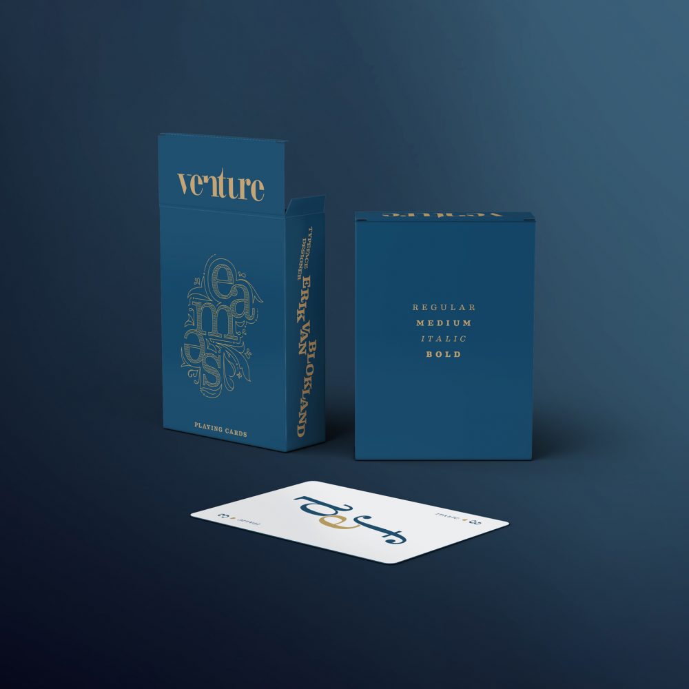
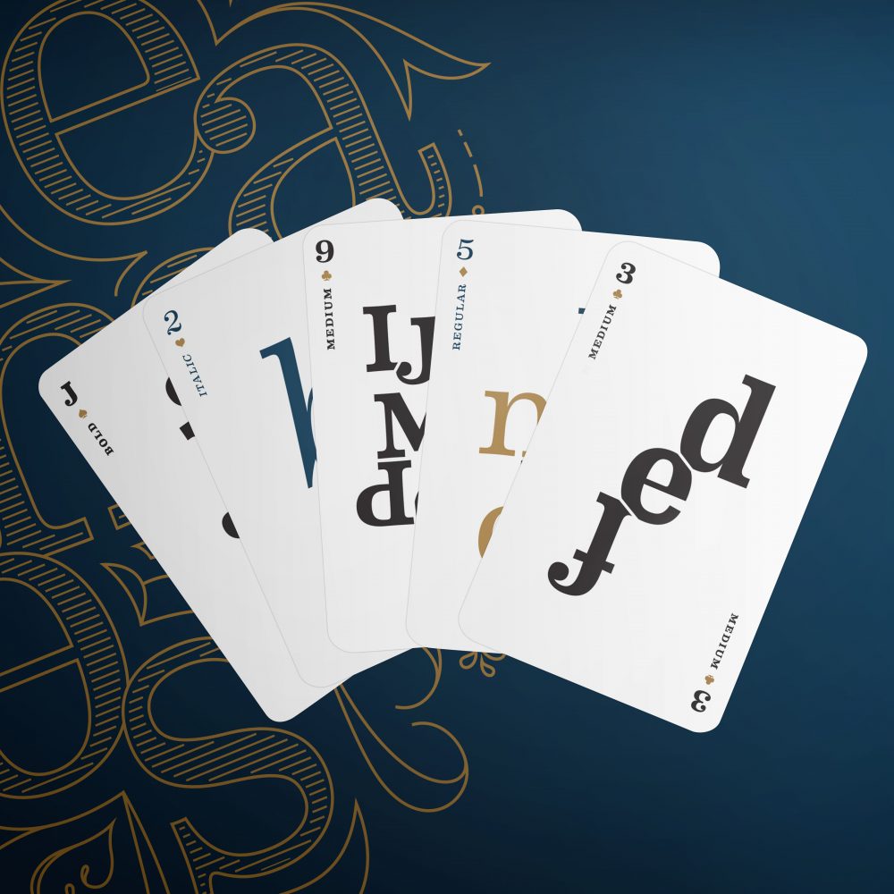
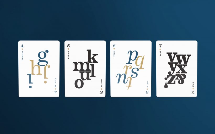
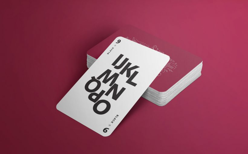
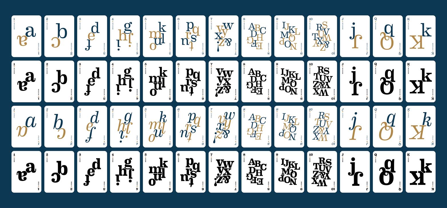
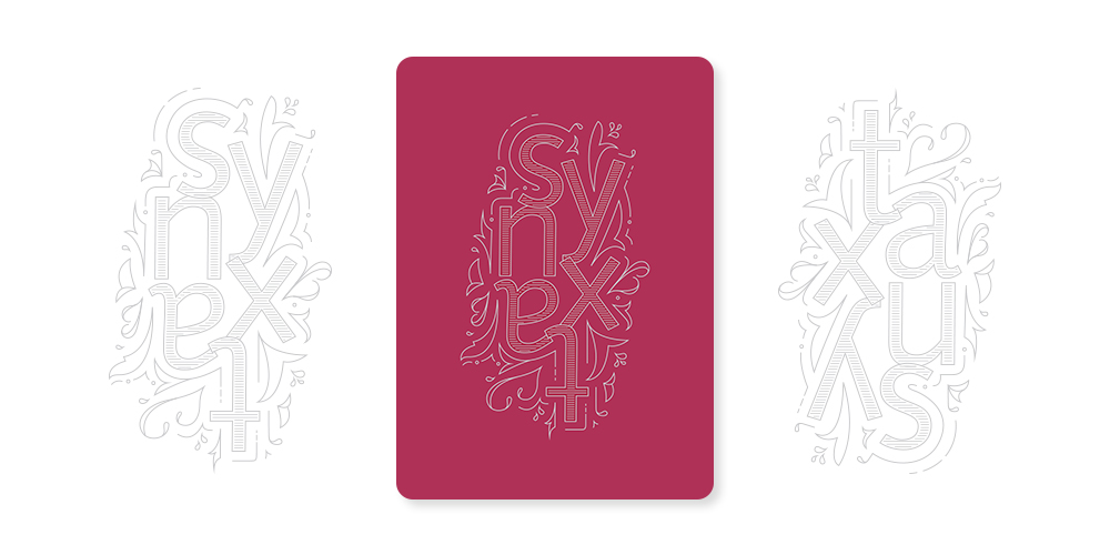
For my promotional piece I created a deck of playing cards that featured a typeface. Each deck featured four weights (aka bold, italic, black, etc.), that replaced the standard suits (spades, clubs, hearts, etc.). Featured is Eames Century Modern by Erik van Blokland & House Industries, and Syntax by Hans Eduard Meier.